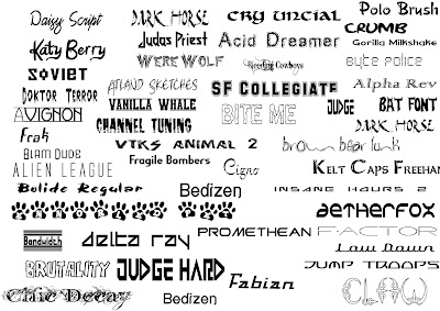
The were wolf font is my favourite and I believe it will link to our song title and video very well, the scribbled effect could be turned red so it looks like blood and would link to "cannibal" theme well as the storyline links to the main character attacking her victims because she wants their blood as it's something she craves so this font will show we have researched into the depth of the song and our original meaning e.t.c.
Doktor Terror is also a contender for a font we can chose for our digipak/album cover because it looks slightly scribbled down which is the reason why I think it stands out so much, the fact that not much effort looks like it's gone into writing is another reason why I think it works so well, because if we used a perfectly neat title it wouldn't have any relevance to the theme we want to give the viewers purchasing the digipak because they would expect the title of the song to be eye catching but also have a linked meaning with the name of the song, if we used the paw print text this would have nothing to do with the song or the video so totally contradicts the idea we want to give to the customers.

No comments:
Post a Comment