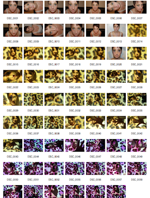
As the focus on the Media Camera in the first shoot was really blurred it meant the images didn't look in anyway professional so as a group we accepted that they could be seen as "test shots". However we used a few of the stronger images for experimentation but they still didn't look how we would of imagined our digipak to look so instead of using bad images we just re took the full shoot but this time with a photography camera so the results where more in focus and as a result looked more professional.
My inspiration for this shoot was from some images I had took in my photography coursework the previous year, using projector head and the board to project a leopard print pattern and for our model (main character) to stand in front of and then do various "animal" poses to show her fierceness but also how her actual character would look so showing a snarling face would show her anger but also how much she wants to "lick humans blood" as that is what a cannibal does.
The results where so much better than the first shoot and as a group we narrowed down 3 images 2 to use for the digipak one showing her angry side as we made her eyes look like she had white contacts in to add more of a scary effect and the other image is slightly more girly and cute so viewers can grasp our idea and see that she has two sides and the cannibal is her alter ego. The other image is going to be used for a poster campaign that we will also create to promote our music video and single, it's a very strong image because by her facial expression you can see how intimate she is being with the camera however the pink leopard background makes it look less scary and more professional.
Front Cover
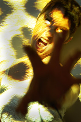
Back Cover
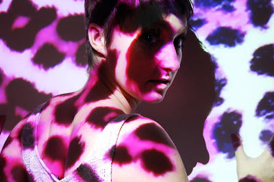
Advert for Poster
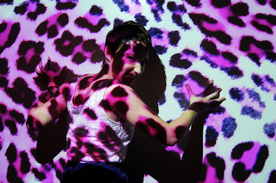
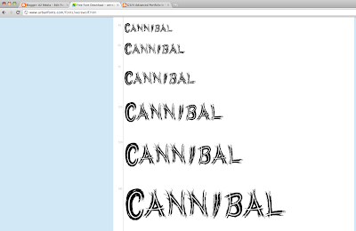
After taking the images we then decided out of the fonts we found through research we needed to choose a final one which would represent our music label and of course the single name. A unanimous vote for the WERE WOLF font was cast as we think it applies to the song name well but also the way it looks like claw marks through each letter adds the thrilling feel that runs through our video. It was almost like the font was actually made for our song choice as it fits the criteria so well.
After choosing the were wolf font we then had to retrace our steps by going back to the actual website that Sophie found it from to make sure it was exactly the same. I then proceeded to download the font into my download file on my desktop and it then immediately opened into the Photoshop fonts box, so we know have it stored for when we actually create our digipak, poster e.t.c and all of these fonts will be the same so it looks actually professional and well thought out. Our next task is to come up with a record label who will be supporting our song and the artist.

No comments:
Post a Comment