We handed our final cut of the music video in on Wednesday so the next thing our group needed to create was a digipak (cardboard cd package), we completed the photo shoot a month ago so all we needed to do was decide which images we were going to use and how we were going to set it out. Because we used pink and original coloured leopard print through the shoot we decided that one side of the package should be an original leopard print theme and the other side pink, this would mean that two photos from each section would be included either side with the original backgrounds in the middle, also because we used these patterns throughout our music video it linked in well and shows that we thought about how we could link in all of our products together because we hopefully will keep the theme running through the advert and any other promo marketing we create.
Because I rarely buy cd's anymore I was unsure about what a digipak looked like, however after I familiarised myself with the layout the plans came together quickly. After downloading a template me and Sophie attempted to put each image into each box however because we had taken some of the images portrait they would have to be cropped down to fit into the box perfectly, this was unexpected because we didn't realise that the set out would be all landscape so instead of cropping the full image down we just shrunk them and added another version of the background to the cover to make sure when we rubbed out the original image there was something behind it. This wasn't what we had hoped the digipak would look like but because we had a "plan b" it all came together. In our last lesson of Media before Christmas break we got every background section put into place and one image shrinked and positioned correctly but we know exactly what our objectives and aims are for when we return. I believe because our digipak includes elements from the music video it shows we have considered a variety of marketing prospects but also popularity of the video because if this was a real pop star scenario they want to make videos that sell and any extra creations will go on top of that and I hope if we stick to our plans the final outcome will be special.
Thursday, 15 December 2011
Tuesday, 13 December 2011
Music Video - First Final
Above is the final of our music video. It took us around a month to film extra scenes again due to the first ones not being suitable and also all of the editing because there are a lot of cuts throughout the song and we needed to match the clip with the beat to make sure it had relevance which was quite time consuming but worth it once you watch the final product.
Today we spent adding the final touches, new filters onto the leopard costume scene to make it stand out just as much as the other clips, we also had to change one of the clips in the middle of the video as it cut from one place where the male actor had no glasses on and then the next time it flashed on he was wearing glasses, so this was only a fault of our own and if we kept it there it would look like we hadn't thought it through and would look very out of place and unprofessional. This is one thing we didn't want viewers to feel because we have put a lot of time and effort into filming and editing this video that we wanted everything we have filmed to look perfect in a sequence, there will always be some elements of the video we would change if we could re shoot parts again but with the time and clips we already had we used them to the best of our abilities.
The final part of the video we had to amend was close to the end, it consisted of one really long clip without any speeding up or cuts which just looked out of place with our up beat song choice, so we had to look through all the clips we had filmed over the month and decided on which ones we could use in the small space we had left to speed up and make it look freaky. It came down to using the tea party scene because this is when the main character does a lot of different body and arm movements as its the "transformation" scene where she turns from a normal human into a cannibal and we thought using a variety of them speed ed up together in a row would work really well and will also be something that the audience wouldn't be expecting which is another element we have thought about because the audience is the biggest critic and putting in extra surprises they wouldn't have thought about makes our music video a unique piece which I am so proud of.
Thursday, 8 December 2011
Putting Final Clips Into Place
After we filmed the tea party scene in Tuesdays lesson all we had left to do was look through each of the clips and decide which ones would fit into the spaces perfectly. this was a long process because it's the first time we have just carried on filming without stopping the video camera which meant there was parts which included just the full group talking discussing how we can make it better e.t.c, that is the only reason they took so long to watch but we finally knew what needed to go where.
But because the song has a lot of different beats we knew that the clips we use needed to be cut when a new beat started so it flowed well and had relevance of being there. Emily inserted the first section of clips into Final Cut however because they hadn't been exported as DV files before hand lines where appearing on the screen which made them look unprofessional and you could tell clearly comparing them to the other sections of video. Although this may have disheartened Emily because she copied the clips into the program and they had to be removed we tried to re enter the clips like she had them but just speed the clips up a lot more and also add in more of a range of cuts because the first reel of them was a continuous play in the same angle which doesn't fit in with the style of the song so that was the only part that we needed to change.
When focusing on the last chorus we knew exactly where to find the clips because we only needed to do a few takes because everyone included in the video was performing arts students they knew to get straight on with there characters and it would be over quickly but they all seemed to enjoy it as well which is a good thing. When we got each of the clips from the last chorus in place we realised that they went on for too long and viewers would start to get bored as no angles are different which meant we needed to re look through all of the clips to swap with parts of the existing ones to make it look more fast paced and also speeding parts up and slowing parts down when needed added a unique touch but also still meant they where lip syncing in the correct way.
All that is left to do to our video now is change one clip close to the beginning of the video as there is a continuity error as in one flash one of the males at the tea party scene is wearing glasses and the next he isn't which doesn't look right so we need to just swap it with another clip. The last thing is add some extra editing techniques in like extra flashing lights for some scenes but lighting is an awkward thing to change because it then means it could be bright in one part of the clip and dark the next it's hard to find a balance so we are best leaving it with what we have got. However some more super imposing might work well for it especially if we cross over scenes of our main character in all the different scenarios together like a montage and if we speed parts up it could look quite scary. We have a few more lessons left but because we have put everything into place and have already captured our digipak images we have time to play about with effects before handing in the final copy of the music video in Wednesday's lesson.
Monday, 5 December 2011
Discussion for Last Chorus

As you can see in the screen grab above there is a large space which consists of the last chorus and as a group we needed to come up with some idea that would relate into our storyline/plot perfectly. Also every little small part of footage that has been cut in the image above is from a separate clip so it shows how much time needs to go into finishing just one verse/chorus. It was really tricky because we didn't just want to fill the space with ideas that haven't been thought about properly. Thinking about a totally new location and scenario we knew would work as it's the theory we have used to get us through most of the video and the outcome has been successful, so creating a brand new scene but having the story line in someway link back to the original is the best thing we can do, we did already have a selection of different videos which would of made our music video complete however due to health and safety regulations they where not allowed to be used.
We have collected inspiration from a range of different music videos throughout filming our own which had the same type of story line or plot that we hope to capture for example Rihanna's Disturbia video, that is very intense and includes alot of horror style dance moves which could make viewers feel uncomfortable but that affect is what we wanted to give off. The set up of Jessie J's Nobody's Perfect is the closest inspiration I believe we could have to our idea as the shot is full with props and actors but also you can see that only the main singer/character is in control of everything which is exactly what we hope to capture from our variety of shots as she will be controlling the "dead bodies" which she attacked throughout the video.
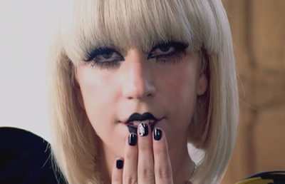
After figuring out how we would set up a tea party scene we needed to think about a location and we knew that the studio that can be provided for us by college would be the best option as it's a blank canvas and the most important thing, it contains tables and chairs which are vital for our scene because if we want on location say an abandoned forest the effect would be lost as no transportation services could take tables and chairs from college just for us students to use, so for this point we thought logically. It was then onto costume and we asked the boys that were included in the beginning of the video to return but this time where smart shirts with a tie because the tea party would be formal, which made it easy to figure out that Emily (main character) would be wearing something formal too and we thought a cute pastel colour dress would contradict what she is (cannibal) and contrast well with the story line, make up would be left simple except from the black lips which is an element we got from the Lady Gaga - Paparazzi video because I believe it just shows a slight amount of bad while she is still looking really angelic.
The hardest element we needed to think about was the actual storyline of this scene and how it would link in well with the verse and chorus of the song. For the verse that starts "I Eat Boys Up, Breakfast & Lunch" we plan to film the main character and the male actors all sitting around a table full of different props which you would associate with a tea party, she will then go on to pouring out "tea" (blood) into each of the male actors cups, who are at this point dead. This process will be filmed very slowly however we will speed it up in the editing stages to make it look more creepy and have some relevance to the idea we have gone with throughout this music video. After pouring the drinks she takes the cups to each of them as well as doing a signature move on each of them which shows she cares for them but she is still the boss so she shows her emotion through anger because she can't help but thrive off the fact she could be drinking their blood. A range of close up medium and long shots will be captured so a lot of cuts can be added to our video showing the main characters facial expressions and the male actors aswell as the full set.
When it gets onto the last chorus we knew instantly because it sounds like more than one person singing it in the original song it would be silly not to have all of the male actors alertly jolt up from the "dead" and start miming the words in sync which will almost look like they are zombies because of the facial expressions they pull, while they are perusing this the main character will position herself in the middle of the table and it's a sort of transformation scene as she is coming out as a cannibal so a lot of jolty body movements which we can speed up again can be captured. When the chorus kicks in and the beats get faster a new idea needed to be brought in so we thought if the male actors are seated when miming the beginning of the chorus they could all jump up from their seats and start walking as if they are still half dead towards the camera and making their bodies disjointed which may make viewers feel uncomfortable but the whole part of the video is horror related. When they are all lined up infront of the table and the main character is now knelt on top of the table the fun part will happen, when the first fast beat kicks in the group will automatically start reciting the macarena which should ease viewers into the video and also make them laugh, this will be done very precisely and body movement will be in sync but also really strong.
We decided that the " oh oh oh oh oh" part of the song will be the "having fun" part of the video where our main character does various different moves which will make people laugh and also have no relevance to the video. So while we have this great set all created we thought taking a few parts of that will work and finish off that full section nicely, because she is surrounded by props we hopefully will get her to throw them towards the camera whilst miming but also making sure she keeps into character which could be difficult but because she is so professional it will work.
Filming Difficulties
Throughout the process of creating the music video we have been inspired through different videos and our own ideas, however, some of the content in which we wanted to be contained in the video went against the health and safety regulations. Due to this we have had to rethink ideas for various chorus's of the song. This has proven to be difficult as through the video's genre, in which we have set, we would like the content to be disturbing and creepy, however there is also guidelines in which we need to follow.
In order to overcome this problem we decided to analyze various ways in which we could portray the creepy effect without it becoming too overpowering. Through studying performing arts I worked on a dance choreographer called Bob Fosse. This particular choreographer focused on the body and movements in order to make the dancer look distorted, this inspired me and gave me the idea of including a short dance routine within the video focusing on Bob Fosse's particular body movements to allow the creepy genre to come in. Through including the dance routine we will also be sticking to the stereotypical elements found in music videos as nearly all female videos contain a dance sequence.
The problem that came to mind when filming the dance routine is that it would not suit the rest of the video and look out of place in comparison to the other footage. In order to solve this we decided that the dance routine would not be fully choreographed as dance and that instead we would show the routine as if the actress was transforming into the cannibal, using gestures such as head turns and flinging the arms around, these gestures could also be sped up so that more fast paced editing is included (as through the peer assessment they said including this will give the video a better effect).
Through looking at the dance routine as a transformation this inspired me furthermore to make the scene more disturbing. The idea in which came to mind was focusing the attention on the actress and instead of her lip syncing to the music, include the actors from the bridge section and have them mime to the song. This allowed the disturbing genre to fit in, as the actors from the bridge section were portrayed as dead, and by having them stay in the position they were and just move their mouths it gives off an unsettling feeling which could shock the audience as the idea of the undead is a scary thought to most.
Tuesday, 29 November 2011
Rough Cut 2
This is the second rough cut of our music video, as you can see there are still quite big gaps missing and this is because we did film scenes for them but when we transferred onto final cut we didn't think they looked as successful as other parts of the video and we didn't want to make it look average using these clips when the rest looks really professional,so we decided that we are going to create a plan and re think what the location and ideas could be for the small parts of the video that we have left to film. This will be an easy job because our main character is really motivated when coming up with ideas and also when in front of the camera she tends to improvise a lot which is exactly what we need to get us rolling. What you can see in this rough cut is use of other editing techniques but also the fact that we have synced the film so well that our actress miming fits in perfectly and looks really realistic.
When it comes down to editing fully I don't think much needs to be done to our video, because everything syncs into place nicely. The only main thing that may need altering is the lighting in each separate clip because they were taken in different angles the light wont have been the same but it needs to look the same to viewers when watching so they could be altered. Also using various different effects will add variety to each one of our shots but also get us the extra marks for experimenting and trying out new techniques.
Wednesday, 23 November 2011
Editing Most Of The Video
The reason I haven't posted anything for the past two weeks is because our group has been editing all of our clips which took us 6 hours to film, so as you can imagine it's very time consuming. After watching every one of our clips we realized some of them needed to be re shot because of timings and as the nights are getting dark really early some of our footage was way too dark to use which was disappointing but as a group we planned what bits we are going to re film next time because making it look professional is the most important thing as all music videos look well thought out and considered and our idea has that element however it didn't come across in the footage.
The editing process does take the longest time because our song choice is fast paced we needed to have a lot of jump cuts in it to match the footage to the beats which is quite challenging but at this stage we have managed to get the first verse fully completed apart from one piece of footage near the beginning of the video when the camera is focusing on the model's body for a long time which we are going to sort out by filming lots of little pieces for example her hands moving around her body or up to her head to link into the sequence. There is then a small part of the filming empty where we need to use around 3 extra's who need to be laying,hanging e.t.c as if our main character has attacked/eaten them. These need to be in totally different locations so everything looks unique and thought out. It's close to the end where most of the filming needs to be re done as we filmed a dance scene which was too dark to add to our video so we are going to change the idea and concentrate more on the main character crawling/jumping from places showing she is hiding but can't wait to let out her true identity. Also we are going to wait till the next day of filming (next week) and decide what movement we can create as a group again to show fluidity and rhythm to the beat of the song but also make sure it has relevance to the video so same costumes could still be worn.
I believe when we have filmed these parts and put them into place all we will need to do is add extra affects over some parts of the video to make them stand out and look different and original but also somehow relate it back to any type of Ke$ha video for example linking with mise en scene glitter and confidence and lots of movement are the key things to think about but I believe once these are complete then we are ready to hand our final video in, in my next post I will display some screen grabs of particular editing skills I have used throughout final cut and write a small paragraph evaluating why but also how I did it for future reference if I ever need to use this technique again the explanation will be useful.
Thursday, 17 November 2011
Digipak Discussion
After taking the shoot specifically for the digipak we then discussed what other aspects would need to be created in order to fill each side of the digipak. After choosing the 3 images (1 with the leopard print background and the other 2 with the pink leopard print background) we had to choose 3 other elements to cover the other sides. Because there was only 1 image with the original leopard print projected over it we thought if we choose another one there would be an equal number of images.
This then lead us onto creating a plan. The inside of the packaging would include all of the pink leopard print images and then just the background itself in the middle, then on the outside of the packaging the 2 original leopard print images would be located on either side of the flaps with the original background image in the middle, this is to show our main character has "two sides" to her on the inside the pink shows her innocent and cute side as she is just a normal girl. However the outside images show her feisty and striking side as she can turn into a cannibal whenever she wants to, its like her alter ego and working with this type of story line is really exciting and we hope by portraying both sides of our character throughout the video the viewers will understand the background story line easily.
This then lead us onto creating a plan. The inside of the packaging would include all of the pink leopard print images and then just the background itself in the middle, then on the outside of the packaging the 2 original leopard print images would be located on either side of the flaps with the original background image in the middle, this is to show our main character has "two sides" to her on the inside the pink shows her innocent and cute side as she is just a normal girl. However the outside images show her feisty and striking side as she can turn into a cannibal whenever she wants to, its like her alter ego and working with this type of story line is really exciting and we hope by portraying both sides of our character throughout the video the viewers will understand the background story line easily.
Wednesday, 9 November 2011
2nd Attempt of Digipak Photoshoot & Final Font
Below are the images taken from our second photoshoot which as a group we had to choose the best 3/4 from to transfer onto our digipak/advert.
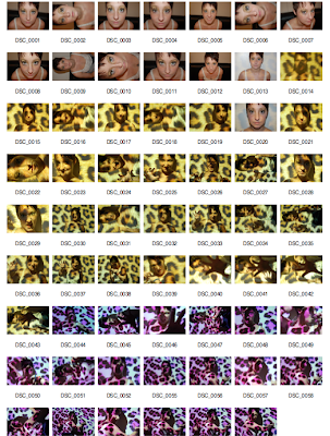
As the focus on the Media Camera in the first shoot was really blurred it meant the images didn't look in anyway professional so as a group we accepted that they could be seen as "test shots". However we used a few of the stronger images for experimentation but they still didn't look how we would of imagined our digipak to look so instead of using bad images we just re took the full shoot but this time with a photography camera so the results where more in focus and as a result looked more professional.
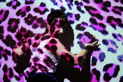
My inspiration for this shoot was from some images I had took in my photography coursework the previous year, using projector head and the board to project a leopard print pattern and for our model (main character) to stand in front of and then do various "animal" poses to show her fierceness but also how her actual character would look so showing a snarling face would show her anger but also how much she wants to "lick humans blood" as that is what a cannibal does.
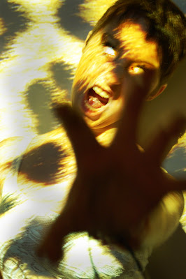
The results where so much better than the first shoot and as a group we narrowed down 3 images 2 to use for the digipak one showing her angry side as we made her eyes look like she had white contacts in to add more of a scary effect and the other image is slightly more girly and cute so viewers can grasp our idea and see that she has two sides and the cannibal is her alter ego. The other image is going to be used for a poster campaign that we will also create to promote our music video and single, it's a very strong image because by her facial expression you can see how intimate she is being with the camera however the pink leopard background makes it look less scary and more professional.
Front Cover
Back Cover
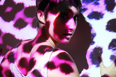
Advert for Poster
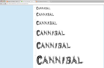
After taking the images we then decided out of the fonts we found through research we needed to choose a final one which would represent our music label and of course the single name. A unanimous vote for the WERE WOLF font was cast as we think it applies to the song name well but also the way it looks like claw marks through each letter adds the thrilling feel that runs through our video. It was almost like the font was actually made for our song choice as it fits the criteria so well.
After choosing the were wolf font we then had to retrace our steps by going back to the actual website that Sophie found it from to make sure it was exactly the same. I then proceeded to download the font into my download file on my desktop and it then immediately opened into the Photoshop fonts box, so we know have it stored for when we actually create our digipak, poster e.t.c and all of these fonts will be the same so it looks actually professional and well thought out. Our next task is to come up with a record label who will be supporting our song and the artist.

As the focus on the Media Camera in the first shoot was really blurred it meant the images didn't look in anyway professional so as a group we accepted that they could be seen as "test shots". However we used a few of the stronger images for experimentation but they still didn't look how we would of imagined our digipak to look so instead of using bad images we just re took the full shoot but this time with a photography camera so the results where more in focus and as a result looked more professional.
My inspiration for this shoot was from some images I had took in my photography coursework the previous year, using projector head and the board to project a leopard print pattern and for our model (main character) to stand in front of and then do various "animal" poses to show her fierceness but also how her actual character would look so showing a snarling face would show her anger but also how much she wants to "lick humans blood" as that is what a cannibal does.
The results where so much better than the first shoot and as a group we narrowed down 3 images 2 to use for the digipak one showing her angry side as we made her eyes look like she had white contacts in to add more of a scary effect and the other image is slightly more girly and cute so viewers can grasp our idea and see that she has two sides and the cannibal is her alter ego. The other image is going to be used for a poster campaign that we will also create to promote our music video and single, it's a very strong image because by her facial expression you can see how intimate she is being with the camera however the pink leopard background makes it look less scary and more professional.
Front Cover

Back Cover

Advert for Poster

After taking the images we then decided out of the fonts we found through research we needed to choose a final one which would represent our music label and of course the single name. A unanimous vote for the WERE WOLF font was cast as we think it applies to the song name well but also the way it looks like claw marks through each letter adds the thrilling feel that runs through our video. It was almost like the font was actually made for our song choice as it fits the criteria so well.
After choosing the were wolf font we then had to retrace our steps by going back to the actual website that Sophie found it from to make sure it was exactly the same. I then proceeded to download the font into my download file on my desktop and it then immediately opened into the Photoshop fonts box, so we know have it stored for when we actually create our digipak, poster e.t.c and all of these fonts will be the same so it looks actually professional and well thought out. Our next task is to come up with a record label who will be supporting our song and the artist.

Monday, 7 November 2011
Rough Cut 1
We chose to film this part of the video because it only included our main character which meant because she is already in our class we didn't have to get anyone else together for example the male character as he was already in a lesson. Also because it meant are main character then knew what we wanted from her for the rest of the video and knew exactly what part she would have to play to get across to the audience in the exact way we wanted which was show her dominating side but also sex appeal which is indicated by the small amount of clothing she wears in each scene. Although this first rough cut is really short we only filmed it a couple of days before the due in date but because our main character is a confident person she can get scenes done straight away when she puts her mind to it which means whatever day we plan to film the rest of the video it will get done in only a few shots because she knows all were there for is to work and not mess around and the outcomes always look professional. The reason it's only very short too is because it is only one verse however we have used a variety of camera angles and her lip sync is perfectly in time so the editing stage was very quick and the end result I believe couldn't have been done any better. The next scene will be the beginning of the video which then includes the main character we did already film this but some slight problems with the camera meant they didn't come out well enough but we know now exactly where we are going with it and because both actors are comfortable with each other the connection will visibly be there.
Wednesday, 2 November 2011
First Filming Scene & Photoshoot For Digipak
Our rough cut deadline was Friday so we knew as a group we needed a full scene filmed to hand in by this day so on Wednesday we filmed the full scene for the second verse of the song. this is when our main character is dressed in leopard clothing and also had leopard print eye shadow to keep in with the theme because every small aspect needs to be enhanced to ensure the video looks professional just like any other artist. We wanted this scene to be filmed inside because most of our other parts of the video are outside and because she is alone in the shot this will enhance her sex appeal.
We took various takes of this one scene but using different camera angles and different props for example a gold chair and also a black couch, we did this because we thought that if we used a part of one shot for each line of the song it would look totally unique as we have added our personal touch and because the main characters acting is so professional we had no problems capturing the shots in half an hour!
Because we got the shots videoed so quickly we decided to hire out the media camera and take the images for the front of our digipak which is another part of our coursework we need to hand in, however we struggled to get the camera to focus properly on our main character which ended in the results mainly being blurry and the only shots that were clear were of the model messing around so we will need to re shoot these images but least we know what to expect and using a studio background means we have a blank canvas to work with when we edit it on photoshop.
Original Image

Saturday, 22 October 2011
Inspiration for Dance Routine
Michael Jackson - Thriller
Because we want our video to have a horror themed twist when it comes to the dance routine I think it's the best element to show our idea off to the viewers. This video is very detailed but the main reason I chose it for inspiration is because of how creepy and disjointed every single dancer looks when getting into their different positions and because it looks so believable it may frighten the audience. Michael is the main character throughout the video and this is indicated by he's costume as all of the dancers are wearing dark colours and he has a red jacket on to signify he's importance, this is exactly what we plan to do in our video our main character will be wearing a revealing leopard print outfit (to link back to cannibal as she would is an animal) with matching eye shadow and styled hair whereas the dancers will be wearing ripped up t shirts and dramatic make up (fake cuts, bruises e.t.c). Also because Michael looks like he is leading each dancer into each separate dance move it looks even more synchronized, there are parts in our video where the main character for example will be crawling across the floor towards the camera with the dancers following behind then there is another part of the routine where she is made the main attraction as she does nothing while the dancers pick her up and spin her round (the camera will be doing an aerial shot to show the full scene in detail).
When coming up with the routine we will definitely look back at this video for some movement and ideas because we want to make them original but also see how other successful artists made there mark because this video will go down in music video history so there would be no other video that could help us with our specific story line.
Beatfreakz - Somebody's Watching Me
The reason I added this video in for inspiration is because it shows the humour in the horror video that they have created which is another element we could think about when filming our own music video. This is another option for us to think about as a group depending on which age range our target audience would fall under for example if we wanted to keep it in the horror genre we would be aiming it for people around 16 and over because children any younger may find it disturbing and scary to watch. However if we kept the humour element in the video but still linked it to horror the video could then be offered to any age group because scenes that could be made scary could be softened down so that no one would be scared or shocked as to what would happen next, this is a hard decision to make because we want to advertise our video to the target audience that will make it the most successful it can possibly be.
For example in this video all of the dancers come up from the grave, this could have been made to look a lot worse with them having dry white skin but because they are wearing brightly coloured outfits and there make up and hair is precise you don't instantly think horror.
However the main reason I chose this video is because the dancing in this is more free style compared to thriller as every individual included in the video has there own style of dance which gives them more of a chance to stand out. This isn't what we want to go for in our video because the main character is named that for a reason, we want to show that she is in control of all of her victims mainly the male generation because she is a strong women and some of the dance routine will back that up for example in one part of the song the victims are seen crawling away from her slyly but she corners them all which shows she has authority over them, this video is good to use for inspiration but not for the layout of their dance routine because it's not as choreographed and thought out as we want ours to be.
Thursday, 20 October 2011
Editing First Shots
After filming the first few shots for our music video, we connected the camera to the computer to start editing when we realized something wasn't right. We looked through each clip that had been filmed and it started to become clear that they were all just of us talking about what position they should be in and how the main character should act/look which made me think that I had stopped recording when the real scenes were taking place and recorded the "deleted scenes" of us as a group getting ready to film.
This is a mistake that couldn't be helped because if I had realized while filming I could of made sure I picked up on it but because I was too busy helping the characters with the step by step movement so it linked back to the song I just pressed the button and moved the camera around to change the angle of view and expected it to be recording however it didn't.
However it did record the first 3 shots that we needed for the beginning of the video, but the element of blood wasn't used so we decided to just re film all of it when we return after the half term holidays, this has made me learn from my mistakes and make sure next time I take more care of looking at the camera when capturing shots to make sure its recording.
We know how we are filming the rest of the video now too and what locations we are using so it will be very easy for us when we go back to college to start from scratch but because our characters are so confident we will get the shots immediately. The main characters costumes are all ready to just be brought in when we come back, we already created the male characters costume before we broke up so he can just re wear it and as for the dancers Emily is going to create their blood covered outfits while she is away on holiday so they are all ready when we come back. This set back has made us more organised and focused on the end product.
Test/Practice Footage
After filming our first scenes we decided that we couldn't use them as apart of our actual music video because we didn't include the blood which is a main element of the song choice and the concept because the main character needs blood around her mouth for the full video and all of her "victims" need it on their body somewhere so the viewers can see that she has attacked them, however the filming we have got doesn't relate to our chosen story line at all because it's not shown clearly. for example both characters are dressed well in there costumes however they look too "normal" the horror part of the video wasn't included (blood, darkness e.t.c).
This test footage we have converted into a you tube video includes the correct positioning and location that we want to use for the beginning of our video and they both got into character well (using the step by steps from the storyboard) so the only thing we need to do when we return from the half term break is re shoot this scene but include the blood in it so the viewers understand the "cannibal" story line easier. The reason we can't do it over the half term break is because our main character is going on holiday and no parts of the video don't include her somewhere in it, but on Thursday in the lesson as a group we talked through each scene and we know exactly what were doing when we get back, the full Tuesday and Wednesday in college will be full on filming everything at least twice so we have extra footage in case it's needed in the editing stage. While Emily is on holiday she is going to make the costumes for all the dancers who are going to be a part of the video and also come up with a dance routine which shouldn't take long for us to capture because the people in our video all do performing arts and some go to dancing so will be able to pick up moves easily.
Although we made this mistake, it's good we have made it at the beginning of the filming rather than in the middle otherwise more would have to be re filmed and I believe this set back has brought us together more as a group to do the best we possibly can when creating this music video.
Wednesday, 19 October 2011
First Day Of Filming
Tuesday 18th October
We began filming a scene from our music video, this scene was the one that involved the main and the male character which was important because it needed to look really realistic and they couldn't lack confidence because it was quite intimate but the reason we decided to use these two people together is because they are both performing arts students as well as friends so the chemistry is already there. For this scene to have an effect on the audience it needed to be filmed outside in a eerie and deserted place to add the creepy atmosphere we wanted, however because it was daylight and quite a sunny day the atmosphere wasn't there but we can add it in when we begin editing by just lowering the brightness and increasing the contrast to make everything look bolder and darker.
Before we went out to film the characters had to get ready, because the main character had a lot more elements to her outfit our male character only had a t shirt that needed to be cut up and made to look mucky which took 5 minutes to do so he was sat around waiting which shouldn't of happened as we should of been more prepared. The main character took way too much time doing her hair and applying make up which meant we only had 30 minutes to film the scene.
The location we used was in an abandoned part of some bushes with a mesh fence in the background perfect for the story we were trying to create, the first take we filmed was of the male character laying on the floor with various camera angles showing viewers that he had been killed/murdered. The next take included the male character laying in the exact same spot now with the main character leaning over him close to the claw and blood marks on he's t shirt suggesting to viewers that she is the one to blame and maybe isn't human due to the damage she had done. The third shot included the male character again staying in the spot but now the song has begun the main character turns away from him and crawls towards the camera making distorted body movements which indicates to the viewers that there's something not right about her, after the beats comes a "rargh" this is when she has reached the camera lens and jolts forward into it while saying that line and making a clawing motion towards the audience. before the next "rargh" she needs to walk back over to the male character and drag him up off the floor while the camera jolts front to back. Before kicking into the first verse where he is seen as the weak character and she is dominating him by feeling he's body and crawling around he's personal space to make him feel uncomfortable but also can't help himself looking at her exposed body.
This is all we got up to in the time period we had, however we shot each take twice to make sure we had a lot of footage to use in the editing stage. The next part of the video involves numerous different people to play victims of the main character who she has killed/attacked in various different places and in different ways.
The only thing we forgot about when filming was to take shots of me and Sophie filming using the equipment and also reki shots of the location and the outfits separately which we will do when we next film the footage. However I believe in the time period we had we did well to get so much done but the main reason for that is because both people got into character immediately and although it was really cold outside they just got on with it.
Monday, 17 October 2011
Location Discussion
We were going to film the first scene for our video in the media recording room because it would be easier and warmer as the weather is getting worse, however it wouldn't give off the same effect like we wanted it to on the storyboard as the male character will be the cannibals attraction and when she begins to hurt him and he knows what's going to happen next he is supposed to run down a long path situated in a forest like place so it looks like he doesn't know where he will end up, this couldn't happen in the television studio because only a background would be used and the effect would be just taken away.
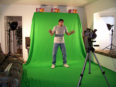
For example below is an image of someone stood in front of a green screen although the background he uses may look believable the actual scene may not work just being stood in one position, but in a music video this wouldn't be tolerated and wouldn't link to the usual conventions especially because we are using a up beat song movement will be needed throughout to keep the viewers entertained.
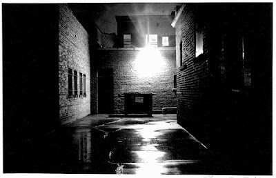
However this dark and deserted alleyway below gives off a much more professional feel to it and for our scene we want to film the male character running quite a long distance away from the main character, so a long alleyway would be the perfect destination also if it is run down and deserted it adds more of the grungy/horror atmosphere to the overall shots and if there is streets coming off the alleyways then the main character could hide in them and jump out on the male which again would add to the suspense of the video and shock viewers which is what we intend to do.
For example below is an image of someone stood in front of a green screen although the background he uses may look believable the actual scene may not work just being stood in one position, but in a music video this wouldn't be tolerated and wouldn't link to the usual conventions especially because we are using a up beat song movement will be needed throughout to keep the viewers entertained.

However this dark and deserted alleyway below gives off a much more professional feel to it and for our scene we want to film the male character running quite a long distance away from the main character, so a long alleyway would be the perfect destination also if it is run down and deserted it adds more of the grungy/horror atmosphere to the overall shots and if there is streets coming off the alleyways then the main character could hide in them and jump out on the male which again would add to the suspense of the video and shock viewers which is what we intend to do.

Hairstyle Ideas
When searching for hairstyle ideas the thought that had to bared in mind was that the actress's hair was short so there was a limit on what to style the hair like. The idea of purchasing wigs was considered however we decided that using the actress's real hair would be a better idea as wigs are quite an expensive prop to purchase and also vigorous movements will be used throughout the video such as the actress violently shaking her head and the wig may not be secure enough to stay on.
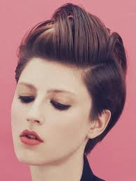
The image above was selected as a hairstyle idea as a quiff has been and continues to be a popular hairstyle. This image however overlaps the hair giving it a more funky and trendy look which is what we want the actress to represent as you find this stereotypically in music videos. This particular hairstyle will be used with the leather costume as combined together they will show a rock chic style much like a bad girl theme which links in with the video as the actress is not a feminine character. The hairstyle also allows the eyes to stand out most by the hair not covering any area of the face allowing the actress to show off her main features as it is the eyes on a female that attracts the male.
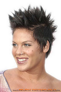
This second image was chosen as a hairstyle idea because of its shock factor as it captures your eye for being so extravagant. This links in directly with the whole theme of the video, the idea of the actress being a cannibal and eating people. The hairstyle will be used with the animal costumes as it represents the actress's wild side. Although the hairstyle is shocking it is also quite stylish as a Mohawk style is used by spiking the top up and flattening the sides.
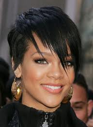
The third and final image was chosen for a hairstyle idea as this is what the actress's personal hairstyle is. We chose this because it will be used with the casual costume and we wanted to bring a personal touch to the character to allow the actress to characterize herself and become the cannibal so the video is far more realistic. It will show the actress's normal side which will allow the contrast of the cannibal to be shown more clearly and flamboyantly. The hairstyle is still stylish as it was inspired from Rihanna who is a well known and very popular singer, however it also shows through its choppy fringe that the actress is perhaps unstable and is covering/hiding something.

The image above was selected as a hairstyle idea as a quiff has been and continues to be a popular hairstyle. This image however overlaps the hair giving it a more funky and trendy look which is what we want the actress to represent as you find this stereotypically in music videos. This particular hairstyle will be used with the leather costume as combined together they will show a rock chic style much like a bad girl theme which links in with the video as the actress is not a feminine character. The hairstyle also allows the eyes to stand out most by the hair not covering any area of the face allowing the actress to show off her main features as it is the eyes on a female that attracts the male.

This second image was chosen as a hairstyle idea because of its shock factor as it captures your eye for being so extravagant. This links in directly with the whole theme of the video, the idea of the actress being a cannibal and eating people. The hairstyle will be used with the animal costumes as it represents the actress's wild side. Although the hairstyle is shocking it is also quite stylish as a Mohawk style is used by spiking the top up and flattening the sides.

The third and final image was chosen for a hairstyle idea as this is what the actress's personal hairstyle is. We chose this because it will be used with the casual costume and we wanted to bring a personal touch to the character to allow the actress to characterize herself and become the cannibal so the video is far more realistic. It will show the actress's normal side which will allow the contrast of the cannibal to be shown more clearly and flamboyantly. The hairstyle is still stylish as it was inspired from Rihanna who is a well known and very popular singer, however it also shows through its choppy fringe that the actress is perhaps unstable and is covering/hiding something.
Thursday, 13 October 2011
Leopard Print Eye Shadow Tutorial
Because we are using leopard print inspired outfit in our video and we wanted to create eye shadow outlining the outfit I thought finding a tutorial video would help us create this look to the best of our ability. Because this woman does it step by step it would be easy enough for us to pause and play the video when putting on the eye make up ourselves. My inspiration for using this type of dramatic make up did come from the Beyonce kitty kat video because it was something I noticed straight away when watching the video and I believe with heavy make up on our main character will feel more confident in getting into the part she has to play, this will also show the fiestyness and sex appeal which links into the "Laura Mulvey" male gaze theory.
Props - Heart
As a group we decided to use a animal heart in our video to add a realistic feel, however after speaking with our teacher she give us the idea to use something metaphorical instead of using an actual heart as many viewers could find it disturbing and if it was a real video many music channels would not show it as the heart alone would be to explicit for day time viewing. So as a group we now have to decide on alternative props that we can use instead of a heart which will still give the same meaning.
I looked into the videos from one of my favourite artists Foals and I come over the video for Cassius which interestingly included hearts being thrown around while being tied to the ceiling by string, I couldn't see the link between the song and the video but I do now see where my teacher was coming from as the detail on the heart is quite vulgar and for vegetarians especially this could make our video banned if we used them but the shots below show my research into this discussion.
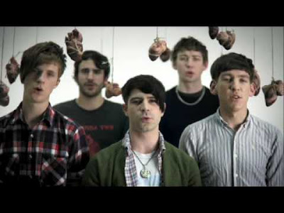
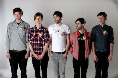
I looked into the videos from one of my favourite artists Foals and I come over the video for Cassius which interestingly included hearts being thrown around while being tied to the ceiling by string, I couldn't see the link between the song and the video but I do now see where my teacher was coming from as the detail on the heart is quite vulgar and for vegetarians especially this could make our video banned if we used them but the shots below show my research into this discussion.


Wednesday, 12 October 2011
Font Experimentation
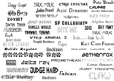
The were wolf font is my favourite and I believe it will link to our song title and video very well, the scribbled effect could be turned red so it looks like blood and would link to "cannibal" theme well as the storyline links to the main character attacking her victims because she wants their blood as it's something she craves so this font will show we have researched into the depth of the song and our original meaning e.t.c.
Doktor Terror is also a contender for a font we can chose for our digipak/album cover because it looks slightly scribbled down which is the reason why I think it stands out so much, the fact that not much effort looks like it's gone into writing is another reason why I think it works so well, because if we used a perfectly neat title it wouldn't have any relevance to the theme we want to give the viewers purchasing the digipak because they would expect the title of the song to be eye catching but also have a linked meaning with the name of the song, if we used the paw print text this would have nothing to do with the song or the video so totally contradicts the idea we want to give to the customers.
Tuesday, 11 October 2011
Monday, 10 October 2011
Inspiration - The Saturdays "Work"
The costumes are the main reason why I chose this video for inspiration because all five singers have smokey eye make up which looks really bold especially when contrasted with the leather outfits because it gives the impression that they are trying to prove something but are really confident about what they are doing as you can tell by their in sync dance moves and also how perfectly timed they are which has given me ideas to think about for our video as we will need to create a choreographed dance routine which links into our song choice correctly so the main dance we could take inspiration from would be Michael Jackson's "Thriller" as they will be able to create the disjointed dance moves to look like they are really weak and only just alive. Another reason why I chose this is because later on in the video the girls then change outfits to casual wear like jeans and long tops which is exactly our idea for the Cannibal video because we want to make sure the audience know that she has two sides to her, sometimes she is a cannibal and goes around eating lots of people but other times she is just a normal human being and would blend in with everyone else. The reason I chose this video to influence that point further is because it's shown in a completely different context and shot but it still gives off the same shot/story line in the way that different scenes are created when outfits change. For example in this video a dance sequence takes place which is the main reason that they change outfits but in our video our model will have a different outfit on in the section of the video when she is alone behind some bars where she feels isolated and alone from the outside world then again another one when the dance sequence kicks in this shows a links between the two videos but it is a usual music video convention because many artist/song writers want the dance part to stick in viewers heads so if they stayed in the same outfit throughout nothing would be different and eye catching so ideas need to be thought out before getting into it which we have already done.
Inspiration - Rihanna "Hard"
The reason this video gives me personally inspiration for videoing our own is because the artist is so dominating over the male actors and they all look petrified to get on the wrong side of her which is exactly how I want the "victims" to feel over our main character because she has/will attack them I want them to always try and be on her best side and not get her angry because they know the consequences just like the men do in Rihanna's video. Another element which we have took inspiration from is the fact that Rihanna still oozes sex appeal even though she is trying to be seen as the one in control her revealing outfits don't stop that and common elements are used, red lipstick to show her passion and fiestyness. The smokey eye make up makes her look instantly eye catching especially to the male audience and gives her alot more confidence. She is also wearing not much clothing which means she wants to show off her best assets in each of her videos to make sure she is living up to her "star image" with fans. We have decided that our main character will wear the revealing clothing and heavy make up for a totally different reason, firstly because she is a cannibal we want her to look captivating in her role but also still give off the sex appeal even with blood and gore all over her body so it shows we want to mix in the feminine side with the cannibal side. The second reason is to separate from any other people taking part in the video, because she is the MAIN character she should be the one people instantly look at so making her outfits more wild and daring compared to say the backing dancers indicates that as a group we have thought about different ways to make sure she stands out rather than say put her in the middle of the screen,for example in this video everyone is wearing green outfits whereas rihanna is wearing white instantly the eye is drawn to her and her beauty, hopefully we will use some of these ideas as inspiration for our video but make sure our own unique ideas shine through.
Sunday, 9 October 2011
Lyric Breakdown
[verse 1]
Rawr! Rawr! 0.03 – 0.07 seconds
I have a heart, I swear I do 0.08 – 0.09 seconds
But just not, baby, when it comes to you 0.09 – 0.10 seconds
I get so hungry when you say you love me 0.11 – 0.12 seconds
Hush if you know what's good for you 0.13 – 0.14 seconds
I think you're hot, I think you're cool 0.15 – 0.16 seconds
You're the kind of guy I'd stalk in school 0.17 – 0.18 seconds
But now that I'm famous, you're up my anus 0.19 -0.20 seconds
Now I'm gonna eat you, fool! 0.21 - 0.22 seconds
In the first part of the video the camera will change from a tracking shot showing a deserted area with leaves blowing across the floor to an extreme long shot which will appear to be a dead body covered in blood on the floor, Emily will then be positioned over the body with her back to the camera and then turn round to face the camera (this is when the beginning of the song starts and she will say RAWR!) with blood all around her mouth suggesting that she has been attacking the body, a disorted and uneasy haze will be edited into the scene to add a slight horror element and make the audience feel uncomfortable. She will also be wearing white contacts to make her look as though she is slightly demented. The body, which viewers will assume has been attacked, will then be demanded by the main character to stand up while she circulates him with he’s gaze constantly upon her. Various gestures are used to show her dominating and enticing emotion for example clawing the male character and also sniffing him because she is a cannibal blood is the main element that she is attracted too in humans. The creepy theme of the video will be kept throughout the characters gestures being quick head to hand movements to make her look un human like. Then she will say the line “now I’m going to eat you fool” and at this part of the video it suddenly cuts to another scene. The next time you see the male character he will be running away.
[chorus]
I eat boys up 0.22 – 0.23 seconds
Breakfast and lunch 0.24 – 0.25 seconds
Then, when I'm thirsty, I drink their blood 0.26 – 0.29 seconds
Carnivore, animal, I am a cannibal 0.30 – 0.33 seconds
I eat boys up 0.34 – 0.35 seconds
You better run 0.36 – 0.37 seconds
I am cannibal! (Cannibal, cannibal, I am!) 0.38 – 0.44 seconds
I am cannibal! (Cannibal! I'll eat you up!) 0.45 – 0.51 seconds
I am cannibal! (Cannibal, cannibal, I am!) 0.52 – 0.58 seconds
I am cannibal! (Cannibal! I'll eat you up!) 0.59 – 1.05 seconds
This part of the song focuses on the main character in various positions while her mental stage takes over, she will be doing lots of distorted head movements and we will make each shot look like there tripping to make it look believable. There will also be various shots of different “victims” that the main character will have attacked. Eg strangled, drowned, eaten etc.
She is oblivious to the camera throughout the full video but the line “you better run” from the chorus she wants to include the audience as if they have entered her personal space and it’s spoken directly to them because she wants them to understand. Then the camera quickly diverts to the male character running away from the main character as he thinks he is now free, throughout the continuous I am cannibal! lyrics it will flip from the male character running away, then to the main character who is playing with the animal heart which she is really fond of which you can tell by the amount of shots we use showing her squeezing the blood onto herself and because its one element of a cannibal that is always linked so she begins to rub the blood into her body because she wants to remise the feeling. Then the camera skips back to the male character running away now looking behind him, as he is scared that she is coming after him.
[verse 2]
Whenever you tell me I'm pretty 1.07 – 1.08 seconds
That's when the hunger really hits me 1.08 – 1.09 seconds
Your little heart goes pitter patter 1.10 – 1.12 seconds
I want your liver on a platter 1.12 – 1.14 seconds
Use your finger to stir my tea 1.14 – 1.15 seconds
Then, for dessert, I'll suck your teeth 1.16 – 1.17 seconds
Be too sweet and you'll be a goner 1.18 – 1.19 seconds
Yep, I'll pull a Jeffrey Dahmer 1.20 – 1.21 seconds
This section of the video will be all about the main character in a
secluded place, this is where she feels free and can be herself. In this section she will be positioned behind metal bars, which will protect her from the outside world, various different distorted and disjointed positions will be used to make her look mental and out of control and make the audience feel uncomfortable while viewing because we are contradicting the conventions linked to a cannibal by using gestures telling them to come towards her they would obviously do the opposite as it wouldn’t be safe.
[chorus]
I eat boys up 1.21 – 1.23 seconds
Breakfast and lunch 1.23-1.24 seconds
Then, when I'm thirsty, I drink their blood 1.25 – 1.28 seconds
Carnivore, animal, I am a cannibal 1.29 – 1.32 seconds
I eat boys up 1.33 – 1.34 seconds
You better run 1.35 – 1.36 seconds
I am cannibal! (Cannibal, cannibal, I am!) 1.37 – 1.43 seconds
I am cannibal! (Cannibal! I'll eat you up!) 1.44 – 1.50 seconds
I am cannibal! (Cannibal, cannibal, I am!) 1.51 – 1.57 seconds
I am cannibal! (Cannibal! I'll eat you up!) 1.58 – 2.05 seconds
The main character will be crawling towards the camera with the victims following behind, she will have a sharp focus by walking to the beat and because she has already attacked them they will look slightly weak and disjointed to add to the scary element. They will then begin to run away in different directions away from her so she doesn’t catch up to them, what they don’t know is that she doesn’t have any intention of moving as she is reminiscing the time that she attacked them all so she will be rolling around the ground with blood fresh on her skin. A dance scene will then follow on from this section with them doing a “thriller” inspired dance routine. The main character however will be doing different moves compared to the backing dancers, as she is the most important person included in the video.
Oh-whoa-whoa-oh! 2.06 – 2.08 seconds
Oh-whoa-whoa-oh-oh! 2.09 - 2.12 seconds
Oh-whoa-whoa-oh! 2.13 – 2.16 seconds
Oh-whoa-whoa-oh-oh! 2.17 - 2.20 seconds
Oh-whoa-whoa-oh! 2.21 - 2.23 seconds
Oh-whoa-whoa-oh-oh! 2.24 - 2.27 seconds
Oh-whoa-whoa-oh! 2.28 – 2.31 seconds
Oh-whoa-whoa-oh-oh! 2.32 – 2.35 seconds
This part of the song will include various montage of the main character in the three different locations we have used, but it will be showing her having a good time by throwing her body around and creating disjointed effects through her body shapes but also sexual poses so that she still appeals to the male audience. This goes against the cannibal nature of the character and shows that she is just a normal girl behind it.
I am cannibal! (Cannibal, cannibal, I am!) 2.36 – 2.42 seconds
I am cannibal! (Cannibal! I'll eat you up!) 2.43 – 2.49 seconds
I am cannibal! (Cannibal, cannibal, I am!) 2.50 – 2.57 seconds
I am cannibal! (Cannibal! I'll eat you up!) 2.58 – 3.04 seconds
The dancers will again be included in this scene as they will be miming this section together before then picking her up showing that she is still the main focus and the dominating one.
I love you 3.06 – 3.07 seconds
I warned you 3.10 – 3.11 seconds
Rawr! 3.11 – 3.12 seconds
This scene will contain both the main character and the male character, there will mainly be close ups shots used as she is explaining each line of this verse write into he’s face so he understands and it will then suddenly flick to the main character clawing the screen on the final lyric “rawr” concluding the video.
Monday, 3 October 2011
Thursday, 29 September 2011
Tuesday, 27 September 2011
Monday, 26 September 2011
Audience Research - Questions
WHO IS YOUR FAVOURITE ARTIST FROM THE FOLLOWING:
· Ke$ha
· Lady Gaga
· Katy Perry
· Beyonce
· Rihanna
WHAT IS YOUR FAVOURITE MUSIC GENRE FROM THE FOLLOWING:
· Pop
· Indie
· Rock
· Dance
· Rap
· Heavy Metal
· Other
WHAT COSTUMES WOULD YOU EXPECT TO SEE IN A KE$HA VIDEO?
As this question was open for any anwser I believe that the costumes would be quie skimpy and sexy to show the artists sex appeal but also they would have a slight worn out and trampy look about them because the artist is known for her wierd and not well thought out dress sense.
WHAT KIND OF SHOTS WOULD YOU EXPECT TO SEE?
In most of Ke$ha's videos meat shots are used to show clearly that she is the most important person in the video and also so you can see facial expressions and beauty more clearly. Also if the video includes dance sequences then medium or long shots are used to include every dancer and show each of the chereographed steps clearly.
WHAT NARRATIVE/STORYLINES WOULD YOU EXPECT TO SEE?
Some of her videos include a relationship storyline in "your love is my drug" she is seen in this whole other world with a man who she looks completely in love with, when watching the video you feel like you are apart of their love story. However in her videos for "tik tok" and "we r who we r" parties and dancing are behind the narratives as it just shows the artist and another large group of people getting into choreographed dance routines which brings out all of their individual personalities.
Thursday, 22 September 2011
Wednesday, 21 September 2011
Audience Profiles
Sunday, 18 September 2011
Wednesday, 14 September 2011
Permission Request - RCA Records
This email is a permission request to the head office of RCA records asking to use a song by one of there signed artists, we told them the video would only be used for educational purposes and wouldnt be used for any other reason which would be a positive point when they think about it and we said we would send our finished video in December, because the song doesn't have a video we have nothing to copy the ideas from so I believe the feedback could be positive.
Wednesday, 7 September 2011
Personal Skills Audit
Digital Technology;
In AS I used various different programs to create my horror movie. The mini dv cameras were the thing I used the most to capture the actual movie and was able to capture the various camera angles that were needed. The macs were used throughout the coursework because that’s where all the other programs are. Final Cut was the program we used to put each scene together and the skills it contributed to the coursework were it was an advanced program and made it look alot more professional. Livetype was used to create our titles for our film and it made them look alot more professional and linked to our genre (horror) well. I used Photoshop to edit pictures linking to our genre and also add the titles to each of them. I will develop these skills in A2 by making the most of each program and using more of the effects given eg Final Cut I will use more editing techniques to make my film look more professional and also develop my editing skills.
Post Production;
I used all of the above programs to create my film but mainly used the mini dv cameras because they captured each of the shots for our film. Then the main program we used was Final Cut because it made my work look alot more professional compared to I Movie which is very simple but in final cut there are alot more editing techniques you can use such as the colour wheel to change each shot separately so it looks more like a film sequence. You can also render each shot after editing it to make sure that it saves. Markers are then used to separate the sound and shot from each other so you can join them up so they are in sync. Livetype has a text feature also so you can choose from a range of texts which can relate to different themes. The rest of the programs were used frequently but were not the main ones. To develop my skills at A2 by using a wider range of programs to make my work stand out from others and also make it look alot more professional.
Research and Planning;
I completed a range of tasks for my research including a mind map relating to my specific genre to help me realise the themes that are included, also various analysis of films linking to my chosen genre give me some idea on how the films are set out and what the storylines usually are. I then had to choose a specific horror film for a 9 screen analysis and talk about what was in the different shots and what the storyline was behind it. Research was then completed on BBFC which is the company behind the age limits on each of the films that are released. Audience research was then completed to see which type of people watch horror films which would help me when creating my film because I would then know my target audience. After my research was completed I then came up with some ideas for an animatic storyboard to show how each shot would link back into the genre. These skills helped me keep to my deadlines as I handed all my work in on time so showed I had good timekeeping skills which helped me get all my work done quicker. In A2 I will plan a lot more efficiently to make sure all my work is up to a high standard and also do a lot more research into digipak and advert analysis.
Using Conventions of Real Media Texts;
The texts I analysed all linked back to my chosen film genre including; Orphan, Turn of the Screw, Scream, Freddy Kruger and Nightmare of the Elm Street. The only film I took inspiration from was Orphan because I really like the storyline because it contained a young girl and that’s exactly what I wanted to include. By using these films it give me the skills to create my film by using the media conventions and inspiration from other existing films. In A2 I will develop my skills by looking at more of a range of media conventions linking to the specific themes and also challenge them by using my own ideas.
Creativity;
Some of my portfolio in AS contained some imaginative ideas including our storyline, when linked to average horror film conventions the storyline normally ends with one of the characters dying. In our horror film the main character survived which shows we thought in depth about our ideas and challenged the media conventions. The props we used throughout the film linked well with the media conventions for example using rope as an element to try and kill our main character could be used in any type of horror film also when our main character runs away from the stalker this always happens in horror films to add a lot of suspense. By using existing conventions and challenging them with my own I believe it give us more of an idea on how we would put the film together as well as what media conventions we would link into the overall film. I will develop these skills I used in AS in A2 by using more of my own ideas to make the overall filming and the end product more interesting for example making the storyline have a completely different background and give the viewer’s more to think about.
Monday, 22 August 2011
12 Frame Analysis - Example (Stay Awake)
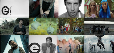
Shot 1 : 0:04 seconds
The first shot I have decided to use is a long shot showing a full length view of the artist, I think this has been used to show how small he is in context with the letter he is leaning agaisnt which also links to the whole message of the song and the video. The subject (artist) is situated on the left hand side of the screen agaisnt the large letter "E" which stands for he's bands name "Example", the letter almost looks like it's shadowing the artist which shows the audience that the artist wouldnt be known to them if it wasn't for hes band hence the size difference.
I believe because the artist wanted to voice out such a strong opinion about the generation we live in and how no body is treated the same because we are all different the composistion of the shot only includes the letter and the artist to make sure the audience's attention is completely focused.
The artist is wearing a baseball jacket and converse type shoes which is what the audience are used to because it's how he stands out from other artists. The main prop used in this shot is the giant letter which gives off alot of impact and is very eyecatching. The location and colours used again are very minimal to make sure all attention is focused on the point the artist is trying to get across so this shot looks like its been shot in a studio which is better than a busy background and the colours are black and white which contrast well together and make it stand out compared to other videos.
Shot 2 : 0:09 seconds
The second shot shows a birds eye view frame used to show the various tattoo's on this one individuals body and also hes body language. This camera shot has been used I believe to show how individual this person is,compared to the "average person" who wouldnt be seen to have that many tattoo's. I also think its been focused just on the persons body is to show the subject they are focusing on as he's head is not in the frame because linking back to the narrative many people are not accepted for what they are so it's as if he doesnt have the right to be fully shown because he doesnt look the same as everyone else.
I really like the way this show hasnt had much effort put into it in the way the composistion isint directly in the middle and you can see someone else sat next to the person. Also no costumes or make up had to be used because the main subject is the male's tattoos and being shot in natural light means you can see them alot more,as you can see the subject is sitting on a car which again means no real posistioning has gone into this shot.
Shot 3 : 0:20 seconds
This shot is more of a close up of the artist to show the real emotion in he's face and I believe this is because the narrative of the video he is trying to get across to the audience means alot to him. He is posistioned in the middle of the frame because he is the only singer in the band, so all attention is on him. You can see from the focus in he's eyes that the words he is singing have truth in them. Again the colours are black and white which are only shown on shots of the artist himself, this may play another part in the narrative to show he is "different" from the rest of the people in he's video.
Shot 4 : 0:26 seconds
This is one of my favourite shots from the video because instantly you can tell these girls love to be different and are confident in there own skin. They are both framed in the middle of the shot so you can also see the background behind them this maybe because it will intrigue the audience as to why the location for this shot is in the woods/forest and not in a busy town centre where girls there age normally hang around. The costumes used in this shot I believe would be the girls own clothes as they play a significant part in what makes them different, this element I believe is used throughout the video in the way that no directors or costume designers have given anyone (but the artist) clothes to wear and the camera crew have gone to them to shoot thier outlook on life for the video's narritive. There facial expressions show that although they are different they are not happy and this is again what links back to the narritive of people not being accepted because there different.
Shot 5 : 0:36 seconds
The shallow focus on this shot makes it much more interesting to look at and although it's a medium shot the composistion shows two people in the shot both on different levels but are still linked together this maybe to get the viewers to widen what they are looking at in a shot and to also link back to the narrative which this shot does well. The army tank at the back of this shot with one of the people stood on top of it indicates the narrative to the shot relates to voilence and fighting and how it occurs frequently around the world and as the man closest to the camera is clenching he's fist it suggests to me that because these two men are "different" voilence is something they may have to take from other people whether it be mental discrimination (racism) or physical (fighting). The costume that these two men are wearing is very casual, however the leather hat and jacket that the man closest to the camera is wearing suggests he has he's own sense of style, just like the other people in the video. One of the reasons for the prejudice and discrimination they recieve. As this shot is in a deserted field it does work well with the tank and the characters each of them are playing.
Shot 6 : 0:44 seconds
Shallow focus is again used in this shot but as the shot moves to the right the quality of it becomes deeper. I believe they have used this effect in the editing stage because you can see what the objects are in the shot without it being clear and without it the whole shot would of been pretty plain. The shot includes two peices of china hanging from peices of rope and with the background faded I can still make out that it's in a forest, so they may have been used to reflect the personality or the love of one of the people used in this video, this certainly shows the element of them being different but not necesserily in a bad way. But I think the main use of them is to show the entrance into the place all of these people hang out in away from the world of people who discriminate them.
Shot 7 & Shot 8 : 0:52 & 0:53 seconds
I have decided to analyse these two shots together because they both have the same narrative behind them they have just been shot in two different locations. Shot 7 has been taken from the forest scene wereas shot 8 has been taken from underneath a tunnel. These places/locations both indicate to me that they are places these people chose to hang out at. Both camera angles are long shots so you can see everything that is happening and also pick up on every little detail. The composistion of the shots is also really similar because the main element of each is shot 7 has a circus type of tent and shot 8 has a variety of speakers and the people are all posistioned around these which I believe contains the music that they are all dancing too. You can't see what make up each of the people have on in the shots but the costumes used I would believe are there own clothes because as you can see they are all dressed individually because they all have seperate styles and linking this back to the narrative of the video it now leads onto these two locations are the only places these groups of people can hang out with each other without feeling like someone doesn't like and you can see there positive emotions in there body language, even though they all look like they are having a good time I do believe that they shouldnt have to hide away from everyone to be thereselves.
Shot 9 : 1:08 seconds
The composistion is the only reason I chose this shot because the man is standing so close to the camera he looks as if he is almost being squashed in by the two high rise buildings. I think the buildings indicate this man standing up for himself agaisnt the disrespectful people because of the lyric "If we don't kill ourselves, we'll be the leaders of a messed up generation" and the messed up generation line is what the rest of the world believe these group of people are which is wrong. The camera has also been posistioned on a low angle to make sure the male was centre of the image with the two buildings at either side. Again the costume/make up looks like the males own choice and again shows how he is different. The lighting is very good because the camera is facing up over it's catching all the light from the blue skies which reflects perfectly over the shot. Linking back to the narrative this shot shows a change in the "generation" as you can see the male's body language has changed and he seems to be alot more confident and a "leader" of what he believes in, he's looking at the camera directly as to say "this is me" which is I think what the artist wanted the video to do, for people who are seen as different or individual to know it's ok and to be confident in who they are.
Shot 10 : 2:10 seconds
This is another artist shot because I thought that it was needed to show how he's body language and emotion had changed from the beginning of the video and also that he still has shots in it and the limelight has not been taken away. This is a medium close up shot of the artist and the reason I dont think they used a close up is because they wanted to give the effect of the artist getting closer up into the camera lens in a way that he was making sure the audience are still paying attention, Like a check point really. The composistion includes the artist and also the "E" logo because thats how everyone recognises the artist it's also been used so you seperate the artist from the other people used in the video. The location, props and costume are all the same as shots 1 and 3. This shot I believe just shows by the artist facial expression he is wondering if the viewers are taking the video meaning in.
Shot 11 & Shot 12 : 3:01 & 3:08 seconds
These two shots are like shots 7 & 8, very similar so I am going to analyse them together. The camera is again at a medium shot for both of these because they include various number of different people so I decided to use these two shots because you can see most of the groups in both shots. In shot 11 it includes the group having a powder paint fight and in shot 13 it shows the group jumping through water sprinklers, I believe these two activities have been used to show the groups celebrating and could be for many different reasons but I believe the main one is that they are all confident now in who they are and know that being different isint a bad thing infact it's better than following the crowd. Costumes and make up can't really be seen in either of the shots because of the action that's taking place and the props (paint and water) that are being used. The narrative of the video ends with all the people included in it jumping around having fun with each other and appreciating how different they are but by taking part in these activities shows they are just like the rest of us and I believe the story behind this video is so clear and a really good message to send out and the performance by the artist and the other people used in the video relates to the message really well.
Subscribe to:
Comments (Atom)


