

Song Title - WEREWOLF FONT


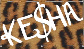
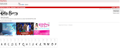
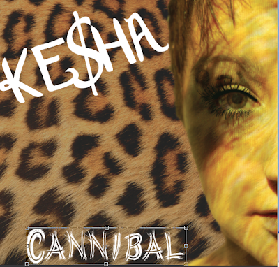
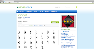
All of the images above show the process I went through to get each of our fonts onto the actual digipak itself and because it was the same process for each, I am going to talk about the steps for both of them. Firstly because Sophie was the one who made the font mood board I had to ask her what was needed to be typed in Google to get the exact fonts we had chosen to use (Werewolf and Katy Berry) after following her instructions - Werewolf font and Katy Berry font for each of the searches the first link that came up was the correct one (Dafont.com for Katy Berry)and (UrbanFonts for werewolf)when on each of the websites it shows you a mock up of words indicating what the font will look like in each letter, the download button is also visible and instructions are easy to follow. When I was certain that these two fonts would contrast together well I downloaded them both and they appeared on the lower bar at the bottom of the screen which gave you a time of how long each where going to take, when finished they were both transferred instantly into my download folder and before I could start using them on Photoshop I had to double click on each of the fonts folders separately and select "install font" which meant they were both now going to be in the font list on any program I used.
When they were both successfully added to Photoshop I then created our artists name using the Katy Berry font as you can see close to the top of this post the first image shows the sizing for the font and other options we could change and then below shows the final product. Underneath that is a screen grab of the website we collected the font from to show that we had to go through the downloading stage and it wasn't already there for us to use. The same process is for the Werewolf font I wrote the song title in the font and the sizing and other options can be seen for that with the final outcome underneath which includes both fonts together and means the examiner and any other viewer can see how well they work together and have a direct link. Before the final image showing the website we collected Werewolf font from as that was also not available from the start.
As I had already created the digipak before I took screen grabs instead of doing it step by step I thought that the fonts would be the easiest to discuss but also show the step by step options as other programs where used other than Photo Shop. However to show you a range of steps we took for the advert screen shots I will select other elements of the advert except text and then explain how they were created and what I did to make the outcome look how it does.

No comments:
Post a Comment