
G324 Advanced Portfolio Michaela Marsh
Tuesday, 29 November 2011
Rough Cut 2
This is the second rough cut of our music video, as you can see there are still quite big gaps missing and this is because we did film scenes for them but when we transferred onto final cut we didn't think they looked as successful as other parts of the video and we didn't want to make it look average using these clips when the rest looks really professional,so we decided that we are going to create a plan and re think what the location and ideas could be for the small parts of the video that we have left to film. This will be an easy job because our main character is really motivated when coming up with ideas and also when in front of the camera she tends to improvise a lot which is exactly what we need to get us rolling. What you can see in this rough cut is use of other editing techniques but also the fact that we have synced the film so well that our actress miming fits in perfectly and looks really realistic.
When it comes down to editing fully I don't think much needs to be done to our video, because everything syncs into place nicely. The only main thing that may need altering is the lighting in each separate clip because they were taken in different angles the light wont have been the same but it needs to look the same to viewers when watching so they could be altered. Also using various different effects will add variety to each one of our shots but also get us the extra marks for experimenting and trying out new techniques.
Wednesday, 23 November 2011
Editing Most Of The Video
The reason I haven't posted anything for the past two weeks is because our group has been editing all of our clips which took us 6 hours to film, so as you can imagine it's very time consuming. After watching every one of our clips we realized some of them needed to be re shot because of timings and as the nights are getting dark really early some of our footage was way too dark to use which was disappointing but as a group we planned what bits we are going to re film next time because making it look professional is the most important thing as all music videos look well thought out and considered and our idea has that element however it didn't come across in the footage.
The editing process does take the longest time because our song choice is fast paced we needed to have a lot of jump cuts in it to match the footage to the beats which is quite challenging but at this stage we have managed to get the first verse fully completed apart from one piece of footage near the beginning of the video when the camera is focusing on the model's body for a long time which we are going to sort out by filming lots of little pieces for example her hands moving around her body or up to her head to link into the sequence. There is then a small part of the filming empty where we need to use around 3 extra's who need to be laying,hanging e.t.c as if our main character has attacked/eaten them. These need to be in totally different locations so everything looks unique and thought out. It's close to the end where most of the filming needs to be re done as we filmed a dance scene which was too dark to add to our video so we are going to change the idea and concentrate more on the main character crawling/jumping from places showing she is hiding but can't wait to let out her true identity. Also we are going to wait till the next day of filming (next week) and decide what movement we can create as a group again to show fluidity and rhythm to the beat of the song but also make sure it has relevance to the video so same costumes could still be worn.
I believe when we have filmed these parts and put them into place all we will need to do is add extra affects over some parts of the video to make them stand out and look different and original but also somehow relate it back to any type of Ke$ha video for example linking with mise en scene glitter and confidence and lots of movement are the key things to think about but I believe once these are complete then we are ready to hand our final video in, in my next post I will display some screen grabs of particular editing skills I have used throughout final cut and write a small paragraph evaluating why but also how I did it for future reference if I ever need to use this technique again the explanation will be useful.
Thursday, 17 November 2011
Digipak Discussion
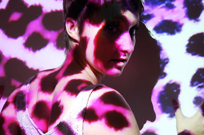
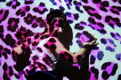
After taking the shoot specifically for the digipak we then discussed what other aspects would need to be created in order to fill each side of the digipak. After choosing the 3 images (1 with the leopard print background and the other 2 with the pink leopard print background) we had to choose 3 other elements to cover the other sides. Because there was only 1 image with the original leopard print projected over it we thought if we choose another one there would be an equal number of images.
This then lead us onto creating a plan. The inside of the packaging would include all of the pink leopard print images and then just the background itself in the middle, then on the outside of the packaging the 2 original leopard print images would be located on either side of the flaps with the original background image in the middle, this is to show our main character has "two sides" to her on the inside the pink shows her innocent and cute side as she is just a normal girl. However the outside images show her feisty and striking side as she can turn into a cannibal whenever she wants to, its like her alter ego and working with this type of story line is really exciting and we hope by portraying both sides of our character throughout the video the viewers will understand the background story line easily.
This then lead us onto creating a plan. The inside of the packaging would include all of the pink leopard print images and then just the background itself in the middle, then on the outside of the packaging the 2 original leopard print images would be located on either side of the flaps with the original background image in the middle, this is to show our main character has "two sides" to her on the inside the pink shows her innocent and cute side as she is just a normal girl. However the outside images show her feisty and striking side as she can turn into a cannibal whenever she wants to, its like her alter ego and working with this type of story line is really exciting and we hope by portraying both sides of our character throughout the video the viewers will understand the background story line easily.
Wednesday, 9 November 2011
2nd Attempt of Digipak Photoshoot & Final Font
Below are the images taken from our second photoshoot which as a group we had to choose the best 3/4 from to transfer onto our digipak/advert.
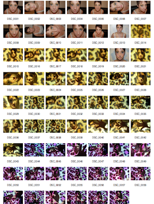
As the focus on the Media Camera in the first shoot was really blurred it meant the images didn't look in anyway professional so as a group we accepted that they could be seen as "test shots". However we used a few of the stronger images for experimentation but they still didn't look how we would of imagined our digipak to look so instead of using bad images we just re took the full shoot but this time with a photography camera so the results where more in focus and as a result looked more professional.
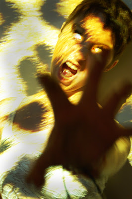
My inspiration for this shoot was from some images I had took in my photography coursework the previous year, using projector head and the board to project a leopard print pattern and for our model (main character) to stand in front of and then do various "animal" poses to show her fierceness but also how her actual character would look so showing a snarling face would show her anger but also how much she wants to "lick humans blood" as that is what a cannibal does.
The results where so much better than the first shoot and as a group we narrowed down 3 images 2 to use for the digipak one showing her angry side as we made her eyes look like she had white contacts in to add more of a scary effect and the other image is slightly more girly and cute so viewers can grasp our idea and see that she has two sides and the cannibal is her alter ego. The other image is going to be used for a poster campaign that we will also create to promote our music video and single, it's a very strong image because by her facial expression you can see how intimate she is being with the camera however the pink leopard background makes it look less scary and more professional.
Front Cover
Back Cover
Advert for Poster
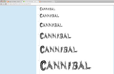
After taking the images we then decided out of the fonts we found through research we needed to choose a final one which would represent our music label and of course the single name. A unanimous vote for the WERE WOLF font was cast as we think it applies to the song name well but also the way it looks like claw marks through each letter adds the thrilling feel that runs through our video. It was almost like the font was actually made for our song choice as it fits the criteria so well.
After choosing the were wolf font we then had to retrace our steps by going back to the actual website that Sophie found it from to make sure it was exactly the same. I then proceeded to download the font into my download file on my desktop and it then immediately opened into the Photoshop fonts box, so we know have it stored for when we actually create our digipak, poster e.t.c and all of these fonts will be the same so it looks actually professional and well thought out. Our next task is to come up with a record label who will be supporting our song and the artist.

As the focus on the Media Camera in the first shoot was really blurred it meant the images didn't look in anyway professional so as a group we accepted that they could be seen as "test shots". However we used a few of the stronger images for experimentation but they still didn't look how we would of imagined our digipak to look so instead of using bad images we just re took the full shoot but this time with a photography camera so the results where more in focus and as a result looked more professional.
My inspiration for this shoot was from some images I had took in my photography coursework the previous year, using projector head and the board to project a leopard print pattern and for our model (main character) to stand in front of and then do various "animal" poses to show her fierceness but also how her actual character would look so showing a snarling face would show her anger but also how much she wants to "lick humans blood" as that is what a cannibal does.
The results where so much better than the first shoot and as a group we narrowed down 3 images 2 to use for the digipak one showing her angry side as we made her eyes look like she had white contacts in to add more of a scary effect and the other image is slightly more girly and cute so viewers can grasp our idea and see that she has two sides and the cannibal is her alter ego. The other image is going to be used for a poster campaign that we will also create to promote our music video and single, it's a very strong image because by her facial expression you can see how intimate she is being with the camera however the pink leopard background makes it look less scary and more professional.
Front Cover

Back Cover

Advert for Poster

After taking the images we then decided out of the fonts we found through research we needed to choose a final one which would represent our music label and of course the single name. A unanimous vote for the WERE WOLF font was cast as we think it applies to the song name well but also the way it looks like claw marks through each letter adds the thrilling feel that runs through our video. It was almost like the font was actually made for our song choice as it fits the criteria so well.
After choosing the were wolf font we then had to retrace our steps by going back to the actual website that Sophie found it from to make sure it was exactly the same. I then proceeded to download the font into my download file on my desktop and it then immediately opened into the Photoshop fonts box, so we know have it stored for when we actually create our digipak, poster e.t.c and all of these fonts will be the same so it looks actually professional and well thought out. Our next task is to come up with a record label who will be supporting our song and the artist.

Monday, 7 November 2011
Rough Cut 1
We chose to film this part of the video because it only included our main character which meant because she is already in our class we didn't have to get anyone else together for example the male character as he was already in a lesson. Also because it meant are main character then knew what we wanted from her for the rest of the video and knew exactly what part she would have to play to get across to the audience in the exact way we wanted which was show her dominating side but also sex appeal which is indicated by the small amount of clothing she wears in each scene. Although this first rough cut is really short we only filmed it a couple of days before the due in date but because our main character is a confident person she can get scenes done straight away when she puts her mind to it which means whatever day we plan to film the rest of the video it will get done in only a few shots because she knows all were there for is to work and not mess around and the outcomes always look professional. The reason it's only very short too is because it is only one verse however we have used a variety of camera angles and her lip sync is perfectly in time so the editing stage was very quick and the end result I believe couldn't have been done any better. The next scene will be the beginning of the video which then includes the main character we did already film this but some slight problems with the camera meant they didn't come out well enough but we know now exactly where we are going with it and because both actors are comfortable with each other the connection will visibly be there.
Wednesday, 2 November 2011
First Filming Scene & Photoshoot For Digipak
Our rough cut deadline was Friday so we knew as a group we needed a full scene filmed to hand in by this day so on Wednesday we filmed the full scene for the second verse of the song. this is when our main character is dressed in leopard clothing and also had leopard print eye shadow to keep in with the theme because every small aspect needs to be enhanced to ensure the video looks professional just like any other artist. We wanted this scene to be filmed inside because most of our other parts of the video are outside and because she is alone in the shot this will enhance her sex appeal.
We took various takes of this one scene but using different camera angles and different props for example a gold chair and also a black couch, we did this because we thought that if we used a part of one shot for each line of the song it would look totally unique as we have added our personal touch and because the main characters acting is so professional we had no problems capturing the shots in half an hour!
Because we got the shots videoed so quickly we decided to hire out the media camera and take the images for the front of our digipak which is another part of our coursework we need to hand in, however we struggled to get the camera to focus properly on our main character which ended in the results mainly being blurry and the only shots that were clear were of the model messing around so we will need to re shoot these images but least we know what to expect and using a studio background means we have a blank canvas to work with when we edit it on photoshop.
Original Image

Edited Image


Subscribe to:
Comments (Atom)