
G324 Advanced Portfolio Michaela Marsh
Showing posts with label Sophie Douglass. Show all posts
Showing posts with label Sophie Douglass. Show all posts
Wednesday, 1 February 2012

Sunday, 15 January 2012
Evaluation Script - Q2
Q2) How effective is the combination of your main product and ancillary texts?
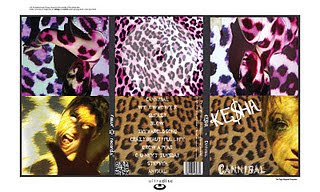 The combination of our main product and ancillary texts are effective because there is a consistent theme of leopard print throughout and this links all of our products together. In our video, the female actress is the main focus throughout and we have reflected this in our ancillary texts by using images of the main actress, which we took during a photo shoot. As the leopard print scenes are regularly shown throughout our video we decided to carry this theme on to our ancillary texts as we thought that it would be effective as it is easily recognisable and links it together well.
We decided to use both the usual leopard print pattern and the pink leopard print pattern in order to make our product more exciting whilst still linking in with our theme. This makes our ancillary products more exciting because there is more of a variety as opposed to just using one colour, this shows both sides of the characters personality which is something which we have tried to convey throughout the video itself. We decided that the original leopard pattern would be used to convey her more animal, cannibalistic personality and the pink leopard print for her calmer, sweeter personality, not only this but it also makes the ancillary texts more attractive to look at as there is a wider variety of colours and this makes it more appealing to people and makes it stand out more.
We consistently used the same fonts whilst creating our ancillary products and chose them accordingly. For the title of the song 'cannibal' we chose a font called 'Werewolf' which illustrates the title as it looks like claw marks. Overall the combination of the ancillary texts and the main product are effective as they have a consistent theme throughout each product which makes them all interlink.
 The combination of our main product and ancillary texts are effective because there is a consistent theme of leopard print throughout and this links all of our products together. In our video, the female actress is the main focus throughout and we have reflected this in our ancillary texts by using images of the main actress, which we took during a photo shoot. As the leopard print scenes are regularly shown throughout our video we decided to carry this theme on to our ancillary texts as we thought that it would be effective as it is easily recognisable and links it together well.
We decided to use both the usual leopard print pattern and the pink leopard print pattern in order to make our product more exciting whilst still linking in with our theme. This makes our ancillary products more exciting because there is more of a variety as opposed to just using one colour, this shows both sides of the characters personality which is something which we have tried to convey throughout the video itself. We decided that the original leopard pattern would be used to convey her more animal, cannibalistic personality and the pink leopard print for her calmer, sweeter personality, not only this but it also makes the ancillary texts more attractive to look at as there is a wider variety of colours and this makes it more appealing to people and makes it stand out more.
We consistently used the same fonts whilst creating our ancillary products and chose them accordingly. For the title of the song 'cannibal' we chose a font called 'Werewolf' which illustrates the title as it looks like claw marks. Overall the combination of the ancillary texts and the main product are effective as they have a consistent theme throughout each product which makes them all interlink.
Thursday, 5 January 2012

Monday, 7 November 2011
Rough Cut 1
We chose to film this part of the video because it only included our main character which meant because she is already in our class we didn't have to get anyone else together for example the male character as he was already in a lesson. Also because it meant are main character then knew what we wanted from her for the rest of the video and knew exactly what part she would have to play to get across to the audience in the exact way we wanted which was show her dominating side but also sex appeal which is indicated by the small amount of clothing she wears in each scene. Although this first rough cut is really short we only filmed it a couple of days before the due in date but because our main character is a confident person she can get scenes done straight away when she puts her mind to it which means whatever day we plan to film the rest of the video it will get done in only a few shots because she knows all were there for is to work and not mess around and the outcomes always look professional. The reason it's only very short too is because it is only one verse however we have used a variety of camera angles and her lip sync is perfectly in time so the editing stage was very quick and the end result I believe couldn't have been done any better. The next scene will be the beginning of the video which then includes the main character we did already film this but some slight problems with the camera meant they didn't come out well enough but we know now exactly where we are going with it and because both actors are comfortable with each other the connection will visibly be there.
Wednesday, 12 October 2011
Font Experimentation

The were wolf font is my favourite and I believe it will link to our song title and video very well, the scribbled effect could be turned red so it looks like blood and would link to "cannibal" theme well as the storyline links to the main character attacking her victims because she wants their blood as it's something she craves so this font will show we have researched into the depth of the song and our original meaning e.t.c.
Doktor Terror is also a contender for a font we can chose for our digipak/album cover because it looks slightly scribbled down which is the reason why I think it stands out so much, the fact that not much effort looks like it's gone into writing is another reason why I think it works so well, because if we used a perfectly neat title it wouldn't have any relevance to the theme we want to give the viewers purchasing the digipak because they would expect the title of the song to be eye catching but also have a linked meaning with the name of the song, if we used the paw print text this would have nothing to do with the song or the video so totally contradicts the idea we want to give to the customers.
Tuesday, 11 October 2011
Thursday, 29 September 2011
Tuesday, 27 September 2011
Wednesday, 21 September 2011
Audience Profiles

This is the audience profile for Cannibal by Ke$ha. This will help us create our music video by designing it to appeal to our target audience.
Monday, 22 August 2011
12 Frame Analysis - Arctic Monkeys (Crying Lightening)

Shot 1: 0:14 seconds. A long shot which shows the a small boat in the ocean, it seems to be either sunset or sunrise and this is indicated by the sun on the right hand side of the shot. It's very misty and cloudy but we can see four shadowed figures standing on the boat with instruments, we assume that this is the band
Shot 2: 0:34 seconds. This mid shot shows Alex Turner, the lead singer of the band standing at the front of the boat, this gives the impression that he is the most important. He is wearing dark colours and seems to look quite relaxed although the sky is beginning to look cloudier. He is holding a guitar which he is not playing, but he is singing.
Shot 3: 0:50 seconds. The mid shot then pans left to show the rest of the band on the boat, they too are wearing dark colours but they are playing their instruments. This gives the impression that the rest of the band are not as important as Alex.
Shot 4: 1:34 seconds. This birds eye view shots shows the water has begun to get rougher which suggests that the weather is changing. The band continue to stay in their places and play their instruments. This gives the impression that they're not worried about whats happening around them.
Shot 5: 1:49 seconds. This mid shot shows the lead singer standing at the front of the boat, the darkened figures of the band can be seen standing behind him but only his face can be seen, this is a shallow focus. It is clear that it has begun raining and that it is windy, you can see this by his hair being blown back. He is beginning to look increasingly anxious at the changing weather and has begun playing this guitar.
Shot 6: 2:01 seconds. This extreme long shot shows that it has became night, the lights on the boat have been turned on and the sea looks rough. The band are still in their original positions.
Shot 7: 2:07 seconds. This is a close up shot of the lead singer, we can see by his face that the weather is changing dramatically, he looks worried and begins to hold onto the side of the boat as it beings to move more. He continues to sing.
Shot 8: 2:32 seconds. The camera moves to show the water which is changing colour and bubbling, lightening strikes it which ties in with the name of the song. We then see something emerging from the water.
Shot 9: 2:41 seconds. A ghost like, giant version of the lead singer appears from the water playing guitar, lightening strikes around him. This is an extreme long shot and we can still see the boat but only the outline.
Shot 10: 3:13 seconds. The rest of the band then emerge from the water playing their instruments which suggests once again that they are not as important or focused on as the lead singer. The narrative throughout the video has been told by the lead singer.
Shot 11: 3:26 seconds. The band have now put down their instruments and are sitting on the boat as they sail past the giant versions of themselves. They look up at them in awe and one of the band has a telescope. Alex Turner is sat at the back of the boat, higher up than everyone else, and also the most noticeable as he is wearing an orange jumper and the rest of the band are wearing duller colours. This is a medium long shot.
Shot 12: 3:36 seconds. The final shot shows the view from the telescope. We see the giant ghost like people go back into the water and the weather begins to get calmer, the final shot is of the weather changing to look peaceful.
9 Frame Analysis - Katy Perry (California Girls)

Shot 1 - 0:00 seconds
The first shot shows the box of a board game. This shot introduces the song and also sets us up for the theme of the video. Lots of bright colours are used so this draws the viewer in and makes them want to watch more of the video. This mainly appeals to a female audience by the colour theme which is mainly pinks. You can not see clearly who the artist is unless you look very carefully, or have seen the video before, so this makes the viewer want to watch more of the video to find out more information
Shot 2 - 0:06 seconds
This shot makes it clear to the audience who the artist of the video is whilst still showing the theme of the video. We see that it's Katy Perry and this is a long shot to show her full body and the setting and theme of the video. This shows us that Katy is a character in a candy themed board game and this sets up the rest of the video narrative. Editing techniques have been used to make it look like Katy is a doll being used in a game, this is shown by the giant hand that places her at the beginning of the board.
Shot 3 - 0:18 seconds
This is a meat shot showing Katy Perry. These are used by the record company to sell the artist. This shot was used as she is famous this introduces the viewers properly to Katy as it is a close up of her face. She is licking an ice cream and this could support the male gaze theory as it is very seductive. This is the first time that the video really appeals to a male audience. Although this shot is seductive she also looks quite innocent which makes us think that this is a very girly video targeted at mainly a younger audience.
Shot 4 - 0:23 seconds
This shot contradicts the theme of innocence and could suggest that everything is not what it seems. Editing has been used to make a giant gummy bear and this keeps in with the candy theme which is so prominent in this video. Katy waves at the bears and they make a rude gesture to her. The bears support the narrative of the video, showing Katy as a sweet innocent character and suggest that the bears may be bad. This could appeal to a younger audience as it has the sense of a fairytale, but also appeals to an older audience by the gesture that the bear makes.
Shot 5 - 1:00 seconds
This is another meat shot but it is also there to appeal to the male audience. This sells the artist, but she is laying naked on a cloud of pink candy floss and winking seductively at the camera which attracts the male viewer. Although there is nudity, you do not see anything which still makes this appropriate for the younger viewers. This is cleverly used as Katy is at the front of the camera, looking directly into it which support the male gaze theory once again but it also is different from the rest of the video as we are taken away from the narrative to see the artist perform, but it still keeps in with the theme of the video overall.
Shot 6 - 1:47 seconds
This medium close up shot shows Katy and some girls with a giant ginger bread man. The composition of the shot makes us focus mainly on the ginger bread man which is strange as the artist is telling the narrative. The fact that they are all huddled around the ginger bread man and he is smiling shows that they may be 'friends' which contrasts with the gummy bears seen earlier in the video. This ties into the theme of a fairytale showing both the good and bad creatures that are in the game.
Shot 7 - 2:11 seconds
This is the first time that we see Katy Perry properly perform. An extreme long shot is used to show the dance sequence which is a generic convention of a pop video. The costumes are keeping in with the theme of the video but are also suggestive as they are quite revealing and Katy has cakes placed over her breasts. The costume choices make Katy stand out even in the extreme long shot as she is dressed in a bright blue colour whereas the dancers are dressed in pinks and yellows. This is cleverly used to show that the artist is still the main focus of the video.
Shot 8 - 2:31 seconds
This shot shows Katy Perry dancing next to Snoop Dog as he raps. This is a common convention of rap videos to have a girl in a revealing outfit dance next to the man. Snoop Dog also keeps in the candy theme as his clothing is printed with cupcakes. The rest of the dancers are on lower levels than Katy and this suggests that she is more important than them and we also focus on her more because of this.
Shot 9 - 3:23 Seconds
Towards the end of the video, we see Katy and her dancers come face to face with an army of gummy bears. We see her shoot them down by firing cream at them. This shot is targeted at males as it is quite suggestive as she shoots the cream from her breasts, but this also appeals to the females as it can be seen as being quite funny. This shows that Katy is overcoming the 'bad' characters in the board game and also begins to wrap up the video by bringing the narrative close to the end.
Thursday, 30 June 2011
Digipak Analysis - Katy Perry (Teenage Dream)

This is the digipak for Katy Perry's 'Teenage Dream'
Throughout the digipak you can see the common theme of 'candy'. This can be seen by the CD designs being a donut and swirly like a candy cane and the images of Katy laying on a candy floss cloud. In the top image you can also see her wearing a crown of sweets. On the track listing some of the letters have been replaced with sweets and this keeps in with the theme of the digipak.
This represents Katy as having a sweet personality and also represents her as being quite innocent, however the fact that she is naked on the front cover contradicts this. The digipak ties in with the genre of music as it relates to her style of music and also gives the audience the idea that her music is not serious and is more on the fun side.
The digipak appeals to a wide audience, the colours are mostly pinks and blues which is quite girly and the theme is also more targeted at females and this theme and colouring could appeal to a younger audience. The fact that she is naked on the front cover could appeal to males as it is quite provocative. The red colours on the digipak not only tie in with the theme but also could represent seductiveness and passion.
The iconography represents the overall image of Katy Perry as it ties in with her video for 'california girls' which has the same theme. This will make it more appealing to fans of her who feel that they have a sense of shared knowledge and it also shows how the candy/wonderland theme may be becoming a signature of hers.
Digipak Analysis - Britney Spears (Femme Fatale)

This is quite a simple digipak, the inside of the digipak is mainly blacks and dark colours, one of the panels contains a photo of Britney which is quite simple and also inkeeps with the theme as she is wearing black. The left panel contains her initials where the right panel contains the initials for the album title. This is very simple unlike some of the other digipaks which contain lots of photos of the artist. The outside covers contradict the theme inside as the colours that are used as completley diffrent, they are very light. The front cover inkeeps with the gold writing theme and the album title and artist name are displayed in big letters on the front.
The front includes an image of Britney looking seductively at the camera which supports the male gaze theory and this could appeal to the male side of the audience. Females are drawn in by the image inside as although the outfit is quite revealing, which would once again support the male gaze theory, it also resembles a fashion image, something which you may find in a fashion magazine and this is what gets the female side of the audience.
Britneys main genre is pop and this itself would appeal to the younger audience, however, as the digipak is quite simplistic this could appeal to an older audience. It may also suggest that Britney wants to be taken more seriously as an artist, compared to previous albums and it may also suggest that she has matured. The main image takes up the full of the front panel, this is because Britney is an artist that people recognise so this would draw someone into buying it as it's clear who the artist is.
The track listing is in black which does not follow the theme of the gold writing, this may be so that it stands out from the other text.
Wednesday, 29 June 2011
Magazine Advert Analysis - Gwen Stefani (Love.Angel.Music.Baby)

Adverts tend to feature the product that they are trying to sell and the brand. For music adverts, the artist tends to be both the product and the band. Music adverts are used in magazines to sell CD's and digipaks. The main image used on a magazine advert is usually of the artist so that the person reading the magazine is instantly drawn to a face they recognise so they will want to read more and find out more. The advert will normally also include a release date so that the reader can find out when the CD is available to buy.
In this Gwen Stefani advert, we see a large image of Gwen which is an enlarged version of the image on the CD cover, the colour scheme that is used in this are quite faded but Gwen still stands out against the background of the image. The image is quite seductive, she is looking down the camera lens and this supports the image of the artist as this is the type of look she goes for, and it also makes it appealing to the male viewer.
The artists name is in big lettering, the same lettering that is used on the album cover and on her own clothing range, this will give fans of Gwen Stefani who recognise this a sense of shared knowledge. It also stands out against the faded colours of the background and the gold/yellow colour makes it seem 'royal'. This theme is kept in the advert by the fact that she is holding a crown and sitting on a thrown. The album title and information are in smaller lettering below, so you first recognise the artist and then go on to read about the release date and other important information.
There is a relationship between the texts and images shown on the advert in that it all keeps in with the theme of royalty. It shows that Gwen seems to be a 'queen' and this could suggest that they are trying to promote her as a the queen of music, which is appropriate as she has been a recording artist for many years.
Magazine Advert Analysis - Marina And The Diamonds (The Family Jewels)

Wednesday, 15 June 2011
Lady Gaga - Judas Video Analysis
At the beginning of the video no music is played, this makes the person viewing the video interested and wanting to find out why there is no music playing. This also introduces us to the narrative of the video, which throughout we see follows the generic conventions of a pop video by mixing the narrative with performance from the artist. The colouring of the video is almost black and white, the colours have been dulled down and this gives a dark effect. The first thing that we see on the screen is the title 'Judas' with a crucifix over the top of a scene of a motorcycle gang. This gives the immediate impression that this song may be themed on rebellion or betrayal, as Judas betrayed Jesus , the motorcycle gang also supports this impression as they are typically seen as being bad news. There is also a required element of shared knowledge needed to get this impression, as people who are not familiar with who Judas is may not be able to make the link however this is helped out by the use of a crucifix which gives the title religious connotations, even to someone who is not familiar with the story of Judas. The red writing for the title is cleverly used as this could signify passion, rebellion or possibly even blood.
As the title fades and we are introduced to a scene of a motorcycle gang driving down a road. All of the gang are wearing stereotypical matching black leather jackets with their names on the back. The first time that we see Lady Gaga we see that she is wearing bright colours which makes her stand out against the dull setting of the video. This is because she is seen as the most important person in the video and the record company want you to focus on her. The quirky and strange costume choice also signifies her personality, something which is easily recognisable to her fans.
The song is very repetitive and uses the word ‘Judas’ a lot in the beginning of the song, this sticks in the viewer’s mind as it is catchy. We see her on the back of the motorbike wearing a crown, this could symbolise her star image as she is thought to be one of the most famous people in the world but it also supports the theme of the video as we see the male who is on the front of the motorbike wearing a crown of thorns. This once again requires shared knowledge for the viewer to make the connection to Jesus. This also helps with the narrative as it could suggest that ‘Jesus’ the man who is on the front of the motorcycle is her boyfriend and she will betray him with ‘Judas’. Throughout the video it tends to follow many of the generic conventions of pop music videos whilst also having original ideas which reflect the personality and style of Lady Gaga. The costume choices used are extremely creative which appeals to a female audience for the fashion aspect, she is also portrayed as a strong individual woman which appeals to the female side of the audience. However, some of the costume choices are quite revealing and this could be saw as her being objectified, which shows that the male gaze theory is used to appeal to the male side of the audience. There are scenes of both narrative and performance throughout which is a generic convention of videos of this genre, the narrative tends to follow a linear sequence however there are some times when the narrative is completely random and does not make sense. There are shots of dance sequences which are also a convention of this genre.
Subscribe to:
Posts (Atom)