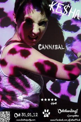
After completing the digipak mock up the next task was to create an advert which would promote our album and music video further. The first task I had to complete was choosing the correct image as the first image we were going to use was a landscape format and most adverts are usually portrait so we will use that image for extra promotion.
When finding the image I believed was strongest I removed all blemishes to give her that "super model" look and also added extra eyelashes on top of her bottom set to make them stand out more, I got these from a download from a tutorial I used earlier in the year and are very easy to apply.
The first thing I added onto the advert was the artists name and because I had already created the digipak I knew instantly to use the "Katy Berry" font but because the advert was on a larger scale I got to make the writing slightly larger because there was a lot more space to fill up, however the chosen font wouldn't convert the dollar sign so I chose a different plain font so I could just add the sign in between the KE and the HA so it said her trademark name Ke$ha. Then went onto add the single name and once again I had already produced it on the digipak so it just meant re writing it and using the werewolf font as before so our brand identity was visible. Because of the shadows from the pattern being so bright and the writing being white I had to make the title smaller than on the digipak so it would fit in the darker part of the image and stand out, but being here at least it's clear to read and central next to the character.
After adding the main text it was then time to add in the company logo and the phone bar code which again are two things we used in the digipak so I just copied them over and re sized them slightly to make them look of a professional standard to be included. I put them both on the lower half of the advert where the image had been darkened as all of these elements would look more thought about if they are all kept together.
It was then onto adding other elements that would only look right on the digipak so meant I had to create them from scratch, the first thing was the release date and by writing it using only numbers it saves space but looks like a actual advert as all artist's use numbered dates instead of words as it's easier and simple to create. Because the werewolf font links into the word Cannibal we thought using the Katy Berry font for any other writing would be more suitable as it's clear which is an element we need so that a range of audiences can see our information clearly as the werewolf font could cause some confusion. After adding the release date I then went onto writing 2 reviews which could have been from any magazine/newspaper talking about our single/album and giving their overall views, the first one was from Heat Magazine and I said that they gave us a 5 star rating, the rating system is a good thing to use I believe because the higher the stars the more interested viewers would be so seeing that our album got the highest rating possible would spark up interest and make people think that it must have something special about it. The second one was from Cosmopolition magazine and their opinion was that the album is outstanding so by putting both reviews together (company small underneath to make viewers notice the positive comments) it would definitely be an indication to our target audience that something positive comes with the album.
The final elements I added was some contact info for the artist herself. I included Ke$ha's actual website which contains all of her videos, images of her and news about herself and also her tours so all her fans can keep up to date with any new gossip that's been revealed. Also I added her Facebook page which her fans could like and information about her will be posted onto their along with competitions, personal images and new videos she has taken from her day to day life so they could see exactly what the artist gets up to when she's not performing. I thought that two would be enough as anymore would spoil the presentation and because these both have a link it shows I have thought about which ones to pick as it again links to the brand identity.
Overall I believe the final outcome looks professional and also shows our main character in a positive light, using the leopard print background again links in with the digipak but also the music video as this is our unique selling point (USP) which can be introduced through the brand identity because if we create anything else that could be used as promotional marketing then all of the options need to be considered.

No comments:
Post a Comment