Wednesday 8 February 2012

Message To Moderator

Dear Sir/Madam,

For this section of my media course I was asked to create a music video; throughout this blog you will be able to see the amount of detail I have put into each of my posts, to direct you around easily I have created tabs for each of the sections including each ; research, planning and construction, drafts, final products and evaluation questions.

I hope you find my blog easy to use and understand the direct links to existing music video conventions

Regards,

Michaela Marsh

Tuesday 24 January 2012

Evaluation Script - Q4

PLAN FOR Q4


- Paragraph on the technologies used in the Research and Planning Stages

Google

YouTube

Word - fill in documents (treatment sheet, call sheets e,t,c)

Cam - Audience Research


- Paragraph on the Construction Stages (Putting video together)

I Movie

Digipak and Advert

Photoshop

- Paragraph on the Evaluation Stages

Prezi

Camera

Media Studio

Stream Clip

Final Cut

Youtube - Convert Videos

Wednesday 18 January 2012

Evaluation Script - Q3

Q3) What have you learned from your audience feedback?

After creating our final draft for the music video we needed to collect a variety of feedback styles from a range of different people (some including our target audience) via social networking sites but also word of mouth. I was surprised at the high percentage of positive comments we received back because as a group there are parts of the video that we would re shoot and change if we had time, so because no one picked up on the smaller scenes that could have let us down it shows that they are not as problematic as assumed. The reason we decided to use the selection of social networking sites is because they have such a large amount of the population accessing them everyday and we thought that instead of just asking close friends to give opinions, opening it up for the general public to leave comments meant we would get truthful and reliable answers from different age ranges and also different genders, this shows we are not being biast by just collecting results from people we know who could only give us successful points because we know them, as a group we were open to any feedback (positive or negative) as it made us think about how things could be changed in the future if we had chance to re do this piece of coursework but also realistically how other people see our video, because some of the feedback we may agree with to an extent but the negative feedback we don’t understand can be used as a useful resource for us to give our own personal evaluation about. Using the Stuart Hall theory to help me comment on each individual feedback comment we received using media conventions and language will show that I have tried to express this specific evaluation analysis at the highest level and as well as using my own personal analysis I hope it’s put into a high grade boundary.

The first comment we received was from YouTube, the reason we posted our video onto this program is because we believed that anyone could view it and make their honest suggestions about the video as a whole. The first comment was from a male who said, “Pros – Lip syncing is good, mise en scene is also very good keeps the audience interested. Good use of props and costumes”
“Cons – One of the main scenes goes on for quite awhile (man running)”
I agree with the fact that the lip syncing was successful as when filming each scene we took a copy of the track for our main character to mime with to make sure when editing every part would be in time. It shows that we kept the audience interested, which relates to the Goodwin theory as we created a different narrative with each of the outfits for example the tea party scene the main character looks very classy however the scene where she is positioned behind the metal bars she looks very casual and also quite rugged due to the holes in the clothes. The reason we created a large amount of scenes is because we wanted to show the audience how her personality changes through different characters and locations and it seemed to interest quite a lot of people we found through the positive feedback we also changed her outfits often to appeal to the male gaze theory and this is definitely a point that has been successful as many people have commented on her being exposed, however it was intentional. The con that he gave us is an element where I can see where he is coming from because when watching the video although there are a lot of cuts of him running up and down the long path it does keep running for some time however because we ran out of time filming the rest of the video we didn’t have any other clips to replace it with, however this criticism is useful as it links to some of my negative outlooks on the video.
The next comment was from a female who also commented through YouTube and because she is a current media student we believed she would pick up on what idea we were going with through the video. Her comment was “Very good lasses, looks very professional. Good job playing the part Emily!” although it’s a short comment it’s positive and I really appreciate the professional part because it means by using existing media conventions and following plans from our research we have created a similar type of video. I believe the main elements that relate to why it looks so professional is how confident our main character was as she took on the personality and cannibal type of character we wanted her portray perfectly but also the variety of shots we captured and the thought beats we have encountered which included a shot cut on each fast beat, this would make it more interesting to watch and could have been a point she was regarding too when she said professional.
The next piece of feedback was from a male who I didn’t know, whereas I knew the other two people who give us feedback I still wouldn’t class them as close friends so they are still being truthful without us influencing their judgements, however this unknown male said “This is pretty well done, good job! Great editing” our editing skills are being talked about once again here, although the previous comment only said “professional” the only reason it was seen in that light was due to the amount of editing we did to our video. When it came down to editing each clip we knew we wanted to make the layout exciting to keep the viewers interested and filters from the editing program brought out the technical side to me especially the superimposing part as I learnt how to lower and increase the opacity over one clip to make the level equal for the reveal of both clips through the first verse. Giving compliments like good job! and well done make me feel really proud that I have achieved such a strong final outcome and people appreciate the work that I have put in.
This comment is from a fellow media student who is in the year below us but personally sent me a direct message letting me know how good the video was so I asked her to leave her own comment on the video so we could use it as another use of feedback, to make it easier for her I also told her to post it on the YouTube account as Emily had only added a number of people to our Facebook page so she wouldn’t have been able to access that. Her comment was “This is such a good video! I really like the effort put into the costumes and the variety of different camera shots and angles. I like the speeded up parts that you have edited in too!” Overall I think this is another positive piece of feedback and she was one of the only people to pick up on the camera angles and shots, when filming the different scenes for this we made sure we took a couple of takes to the side of the characters in front of the characters, behind the characters, up close just to make sure we had alot of footage to work with when putting it all together just so the same angle of one clip was played continuously as attention would be lost. The reason we added the speeded up parts of the main character doing jolter head movements and weird body positions was to reflect on her “cannibalism” as she was hiding behind a normal teenage girl’s body and meant she couldn’t be the person she really hoped to be and through the video you can see how the anger builds up right until she lets go and “transforms” in the tea party scene, but adding a high level of speed to some clips would make the audience look again and again.
This feedback comment came from someone with the name Instant Win which meant it’s hard to determine which sex they are from, but that’s the interesting thing about feedback you don’t know who is going to comment. However they said the following “I liked the effects used when editing especially the superimposing, the lip syncing looks professional and the shots are cut to the beat of the music” The reason we added a superimposed part to our video is the fact that the main character wanted to eat the male character and he was running away from her down a long path but we slowed the running speed down so we could put a clip of her laughing at the entrance of the path so viewers may think she has already caught him and this fades in and out so you can see both characters clearly, however the chorus kicks in and you see him moving at normal speed the technique was used for editing purposes. I talked about the lip syncing previously as our character is a performing arts student she knows her rhythms and sense of beats through a song so she timed exactly when to come in, this was also important when cutting the clips to the beats as it meant fast paced editing hence the reason why we did lots of takes in one location because we knew most of them would get used at least once. Again a positive comment but what I have found out when analysing most of this feedback is it’s all very similar and about the same topics; Editing, Lip Sync and Mise En Scene.

We then went onto posting the video on Facebook in a private group and we received 3 different comments. Because the group was set to private it meant that we only added a certain number of people so chances are we would know them however we wanted the truth so we had something to work with. The first comment read “I like the way that different editing techniques have been used for example when you speed parts up”
The second read “Lip – Syncing is all on time so it looks professional. Some good transitions between shots like the fade one including the slow motion laugh. It’s an interesting video; it wouldn’t get boring after a few watches. Also it’s really scary, I like that.”

Finally the last comment read “I like the use of the fast paced editing and how it gives the video a greater effect overall, also how you used real life locations so that it is more realistic, however there are a few shaky hand movements ( but I didn’t think that was important because the video is so good!)”
The reason I have just quoted all of these comments rather than write about each one of them individually is because they all have similar meanings and I think each point can be spoken about as a whole. Editing is talked about alot they all seem to appreciate the speeded up parts which is good to know as there parts of the storyline which hopefully they have considered why we added them in because as well as entertaining viewers we want each of them to understand the storyline we have created. The fact someone commented on the fact that it wouldn’t get boring after a while brings in again Goodwin’s theory about keeping people interested at all times because I believe when watching it more and more the actual story unfolds. Although I am grateful for all the positive feedback getting criticism is more interesting as I get to give my own feedback on it. One person said the camera movements where shaky at times and this is a point that I 100% agree with and if we could go back and re shoot some scenes I would because it’s distracting but also lacks the professional quality of an actual music video.

I went onto ask people to comment on what they believe the storyline is behind our music video and exactly what they see when they are watching it. The reason I did this was to get more detailed explanations but also to link each of the comments I receive to the Stuart Hall theory. The first comment I received was via Facebook; “I believe that Emily has physiological issues throughout the video and she likes to eat people” this male does have some of the correct perceptions of the video as we wanted the audience to notice a change in her personality from looking and acting like a young girl to bringing out her vicious side and attacking the male characters and I think the reason he has mention physiological is because she is going mad through the video as she just wants to be a cannibal and doesn’t want to hide her identity any longer and she does transform in one of the end scenes, however the fact she likes eating people could be known just by the song title so I think that most people would notice that, linking this comment back to the Stuart Hall theory I think this comment links to the storyline to an extent which in he’s theory is called “Negotiated” Where the audience accepts, rejects, or refines elements of the text in light of previously held views, example neither agreeing or disagreeing with the political speech or being disinterested. The reason I believe this point is true is because he touches on her issues but doesn’t explain what about and how she confronts them, our aim is to make each viewer come up with a storyline and hope it’s the one that we created.

The second comment was given by a fellow media student who we believed would have the ability to use media terminology to a high standard. We again asked him what he thought the storyline behind the music video was he said, "I really enjoyed this piece of work as you can clearly see the storyline is about a young, attractive female who goes around eating boys. This shows you in the lyrics "i eat boys up" Lip syncing is consistent throughout the full music video. I really liked the effects used when editing, especially the superimposing. Overall I find the full video looks highly professional and very entertaining :)". The storyline that he believes to be true is that our main character likes to eat boys, also referring to her as being "attractive" means he has picked up on the "male gaze" theory which shows her wearing revealing outfits to attract the attention of male viewers. He believes that we have illustrated a link between the clips in our video and the lyrics in the song. The reason for this is because we wanted to make sure our music video was keeping in with the media conventions linked to a usual Ke$ha videos e.g revealing costumes, outrageous personality and confident about the characters she is playing, which are some of the elements included in our own video. Linking this into the Stuart Hall theory it shows that the male got our "preferred" reading of the video, which meant he interpreted it in the correct way. Because we wanted to show viewers that our main character had two personalities, one being a normal teenage girl but the other showing her "secret alter ego" which is someone who enjoys attacking attractive looking males to get their blood to feed on. So judging by he's comment this is the exact story line he understood. He also picked up on the entertainment side of the video, this is needed in any sort of video for the viewers to keep interested and because of our variety of locations and shots we knew the viewers would be surprised by some parts.
Overall from the two detailed comments we received, the results where different in some respects but they both linked to the Stuart Hall theory and meant I had a lot to discuss regarding each of them and how they linked back.

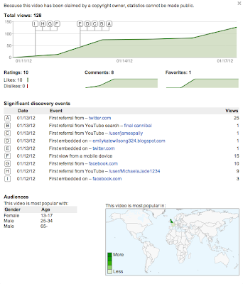
Below is a chart/graph showing how many people have watched our video and what programs they have accessed it by.
You can see the graph at the top of the image with letters which are shown underneath and explain exactly what each of them stands for. I believe this is a useful way to look deeper into where the feedback has come from and when I go onto presenting this specific question I will go into more detail about how many people used the different programs and also analyse the graph to try and estimate the age range for each separate “letter” and also in the bottom corner you can also see where in the world our video is being watched the most and least, this will also be an element I can look deeper into when presenting this question in greater detail.


Overall the comments we received from the feedback have all been positive and any other points where constructive criticism and nothing to harsh, the reason I believe that is because most of the people watching have only picked up on the negative parts that we also agree with so we haven’t been offended or annoyed as we would change each of them parts ourselves with extra time. Now I just need to think exactly how I am going to present this question it’s either going to be through a video where I will talk about each comment in detail why it is shown behind me through the green screen along with our video to link to each comment as this might mean I add elements in that I maybe didn’t think about when writing this, or my other option is to create a prezi and talk about the comments in detail and what my overall opinion is on each of them, clips can be shown on this too but I just need to think about whether the prezi would be entertaining enough for the audiences to look at.

Sunday 15 January 2012

Evaluation Script - Q2

Q2) How effective is the combination of your main product and ancillary texts?

The combination of our main product and ancillary texts are effective because there is a consistent theme of leopard print throughout and this links all of our products together. In our video, the female actress is the main focus throughout and we have reflected this in our ancillary texts by using images of the main actress, which we took during a photo shoot. As the leopard print scenes are regularly shown throughout our video we decided to carry this theme on to our ancillary texts as we thought that it would be effective as it is easily recognisable and links it together well.
We decided to use both the usual leopard print pattern and the pink leopard print pattern in order to make our product more exciting whilst still linking in with our theme. This makes our ancillary products more exciting because there is more of a variety as opposed to just using one colour, this shows both sides of the characters personality which is something which we have tried to convey throughout the video itself. We decided that the original leopard pattern would be used to convey her more animal, cannibalistic personality and the pink leopard print for her calmer, sweeter personality, not only this but it also makes the ancillary texts more attractive to look at as there is a wider variety of colours and this makes it more appealing to people and makes it stand out more.
We consistently used the same fonts whilst creating our ancillary products and chose them accordingly. For the title of the song 'cannibal' we chose a font called 'Werewolf' which illustrates the title as it looks like claw marks. Overall the combination of the ancillary texts and the main product are effective as they have a consistent theme throughout each product which makes them all interlink.

Saturday 14 January 2012

Evaluation Script - Q1

1. In what ways does your media product use, develop or challenge forms and conventions of real media products
Inspiration from videos
Compare and contrast your video to others, costumes and editing etc

When producing our music video we looked into the genre of pop and r&b and the conventions in which came with it. We found that in a stereotypical female video there was a use of emotions to carry a certain meaning as seen in our video the actress comes across as quite an aggressive frustrated character, it is this use of emotion in which allows us to portray the underlying idea of the actress being fed up of hiding who she is and furthermore linking in the frustration of her being embarrassed of being herself. Another convention was the use of males throughout a video and the negative reflection they tend to give off, we decided in our video to use the males in order to show the female as the dominating sex, we did this by having the actress controlling the males and their every movement as if they were helpless against her, it is here were we can furthermore link in the expression of feelings that the actress has towards male and the idea that she is fed up of them being in control and abusing her so she is getting her revenge. The feminist theory can be found from this as it is showing the diversity of the female actress and how she is standing up to the male and is no longer an inferior sex, which goes against the usual representation of woman in media as the ‘weaker sex’. Appearances in a female r&b video are important as the visuals should match the lyrics but a use of fashionable/explicit clothing is also required, it is here where our video can be directly linked as we focused on the lyrical use in order to block the video, for example in the first verse the lyrics ‘I get so hungry when you say you love me’ are represented by the actress circling the male character and gradually making her posture straight directly in front of him, from this blocking you are able to recognize the actress as an animal and the idea of her being hungry so circling her prey before she attacks. The clothing used throughout contributes a great deal to the video as it represents the actress in her different forms, for example in the second verse we dressed the actress in a leopard print leotard, this allowed us to show her as the animal she was being represented as. When dressing the character in her casual clothing we focused on other r&b/pop singers and the clothing that can be found from that genre, an example of this can be the use of the high waisted shorts as the pop artist pixie lott wears these and the r&b artist nicki minaj, this shows that we have took into consideration what is fashionable in the genre so that it matches our video continuity. The clothing which we chose for the actress was explicit across the chest area, we decided on this as we felt that it was this body feature which caught the males attention the most, it is here that Laura Mulvey can be linked and the theory of the male gaze as the notion of looking is directed towards the females body parts.
Inspiration for our video came from various media products; we focused on videos within the genre but also looked into how certain videos managed to create an uneasy atmosphere. In Rihanna’s disturbia you see the use of jolted head movements, we included this in our music video as it gave the illusion that the actress was not stable or in the correct frame of mind, super imposing of two scenes is also included in both the videos, in Rihanna’s video it is used to represent the singers mind and show her as a trapped individual who cannot get away, we took inspiration from this idea but altered it slightly so that the super imposing in our video was of the male actor running in slow motion and the female laughing, it was here that we gave the illusion the male actor cannot get away from the female and it is almost like a game in which humors her showing furthermore the twisted mind of the actress. Fast pace editing is included throughout Rihanna’s video and our own, Rihannas video uses the editing in order to represent the singer as distorted and unlifelike, however in our video we used the editing when the actress was behind bars in order to shake them vigorously, this allowed the audience to see that the actress in our video is trapped and frustrated and wished to escape. The dance sequence, which is included within our video, has numerous inspirations. Rihanna’s distrubia has the dancers walk into position with jolted body movements, similarly in our video we had the dancers walk into their positions acting weak and distorted as if they had just rose from the dead this allowed the slight genre of horror in which we wanted to include to be found as the idea of people rising from the dead is unnatural, another video which inspired us for the dance routine was Beatfreakz Somebodys watching me, the video contains humor alongside the horror through the use of representing well known singers such as the pussycat dolls in a different way, the pussycorpse trolls, we decided to use this idea but rather than change the actors we used the well known dance routine the Macarena, it is here where the humor can be found as the audience will recognize the dance in the video so it will therefore stand out to them but alongside this in relation to the rest of the video it is quite random so will therefore be an entertaining surprise for them.
Another video in which inspired us was Lady gaga’s paparazzi, throughout her video she uses still images of actors who appear to be dead, this too can be found in our video as we felt that this allowed the horror of the video to really stand out through the idea that the actress has murdered these people and is now showing the audience openly and willingly, this then furthermore links in with the underlying emotion of the video and the idea that the actress is no longer afraid to say this is me and I’m not afraid to show anyone.
The final video that we took inspiration from was Jessi J’s Nobody’s perfect. A tea party scene was shot of the singer having a miserable time whilst the other actors around the table were enjoying themselves, we used the idea of a tea party but altered it so that the actors around the table were the people who she had killed in prior scenes and the actress in our video was the one enjoying herself. This gave the illusion that the actress was playing with dead body’s and again linked in the theme of horror. We felt that by including this scene the audience would see the twisted side to the actress and see that she is not a female to be messed with.
When linking in theorists to our video Carol Vernallis can be brought in through our narrative, editing, camera movements and framing and diegesis. Carol says that in narrative the video is a visual response to the music, this can be seen with the narrative in our video as the footage we created was based around a female attacking the male species like a cannibal, for example when the lyrics 'now I'm gonna eat you fool' are used a clip of the female actress going to attack the male actor is used to demonstrate that she is about to feast upon him. Carol furthermore goes on to say that in the narrative a theme/narrative may be run through the video but in a montage style, again this can be found within our video as we wished to show the underlying stages of what the actress goes through and how she gradually becomes more open with her true self. We did this by beginning with the female actress attacking only one male allowing us to represent that she is just beginning to stand her ground and find her feet, we then continued to use footage including various other male actors in which the actress had attached which allowed us to represent that the actress is beginning to feel confident about her true self, we then further more used a scene in which all the male actors are based around a table and are being controlled by the actress representing that she has come even further and is now not afraid to stand her ground and show who she truly is. When it comes to editing Carol said that editing may match the musical phrase or beat, it is this specific point which can be found continuously throughout our music video as through the strong beats constantly used and also the creepy storyline that comes with the song we felt that this would be most effective as it gives the audience the idea that there is a lot going on and things aren't simple. A further point that Carol said with editing is that it may become foregrounded – the edits may be really obvious, to draw attention to themselves as opposed to invisible, continuity editing, in our music video the editing techniques such as super imposing, fast pace editing and filters stand out clearly in the video this is due to the context of what is going on in the scene and it allows that certain section of footage to stand out for a particular meaning, for example the super imposing is used to show the actress as an insecure person and although the 'evil laugh' is silent we are still able to recognize that there is evil in her giving us an uneasy attitude towards her. We felt that through allowing the editing techniques to stand out more clearly it would be most effective as it allows the audience to understand the comparison between the actress to an animal in her behavioral ways behind bars but also allows them to understand the actress and her emotions more and also allows the video to link more freely into the horror genre. Camera Movements and Framing Carol says that When it comes to shot types, extremes are very common and also The camera may move in time with the music. These two points are contained in our music video however our music video challenges point one. We decided that a variety of different length shots would come across as more professional however we focused on mainly medium shots, medium close ups and meat shots. Although we did use long shots in footage, such as when the male actor is running along a path way to get away from the actress, we found that the more frequent shot in our video was medium close up. This length of shot allowed us to focus on the actress's facial expressions but through the shot being not too close to her face gave the idea of that she does not want her space invading so is keeping a distance. As for the second point of the camera moving in time with the music we used the zoom in and out at various parts within the video in order to create the illusion that the audience is creeping towards the actress but is then frighted away from her, allowing the actress to again have a uneasy attitude and create the idea that she is not safe. We ensured that on each beat of the song the camera was zoomed in and out in time in order to match the music and be of a professional standard. The final concept that Carol talks about is Diegesis and she states that Actions are not necessarily completed – they may be disrupted or interrupted in someway. Our music video contained the genre horror and it is from this that we included scenes of the actress 'attacking males' however we do not directly show the actress attacking them this is cause we had to bare in mind the audience and also the storyline of our piece as if we had included scenes of the actress biting the males it would have become too graphic for people of younger ages and also the underlying storyline of the actress becoming free and not scared to show what she is would be lost amongst the scenes as they would have no true relevance. It is from this that we only hinted the actress was attacking the males and therefore the actions of what she was doing were not completed and the next scene stepped in, for example on the lyrics 'now I'm gunna eat you fool' the actress pulls the male actors head back and leans in as if to bite his neck creating the illusion that she has attacked him but without showing the audience anything.

Thursday 12 January 2012

Music Video - Third Final (FINAL)


Although we currently had created two final drafts of our music video, I had been watching it a number of times after checking if anyone had left any comments on it and I seemed to watch it the whole way through and once again I found some problems that I thought I could change before the deadline of the 13th to have our final video handed in because these elements where noticeable but could be changed in order to make our video look of a high standard in the end. The first element that I found was in the first chorus where a flash seemed to occur between a change in two shots, this change was very quick and simple because when opening the video back up in final cut you could see the small gap between the clips so to fix the problem I simply grabbed one end of the clip and joined it up to the other one. However the next two elements where slightly more complicated and time consuming, the Second element was during the "dead people" scene it included two of the three characters used in the final dance scene and then one girl character, however because she wasn't used anywhere else in the video we decided to take her part out and use our test footage in which we used the final male character who would match up to make all 3 characters be linked from the death scene to the dance scene and would make our video flow easily without people asking questions, cutting the scene of just the male was too short so we had to have half of he's scene of just him and the other half of our main character stood over him however it did link perfectly as the clip straight after shows her standing up and walking away. The final element that needed to be changed was of the running scene in where the main victim is pacing up and down the path determined to get rid of the cannibal trying to capture him, at the beginning of this scene the camera work is not focused and moves up and down quite a lot, because we noticed this more and more each time we watched it I took the clip out and replaced it with another clip which meant moving all of the existing clips along because the clip I found showed him running right from the beginning of the path which meant it had to come before any other clip so the fluidity would be seen.
After making the last minute changes as a group we are finally happy with the result and any other major things (lack of adventurous location) cannot be changed anymore as the deadline was a few months ago but that is an improvement we can take on board for the future.

Music Video - Second Final


After re watching our "final" of the music video there was significant elements I reliesed could be changed by exchanging them for new clips or reducing or increasing the speed to make sure the lip sync was perfect and in time. The main element I noticed instantly that was ruining the rest of the video was a part of the end scene where we put a few clips in together just for quickness and to fill up the space which we had sped up however none of them looked like they were supposed to be there and also you could see the other characters talking in the background which was totally unprofessional so I made the decision of removing the whole section and replacing the clips with a variety of clips used from scenes throughout the video which could be sped up but also played backwards to add more of a freaky yet unique effect. I tried to choose clips which didn't include any lip syncing or minimal so it wasn't noticeable on the clips and the end result was successful as now it looks like each separate clip has been thought out but also by changing that small scene it gives the whole video a round up towards the end like a "flashback" scene of everything they have watched throughout but backwards which shows our creative flare as a group. We then believed that this would be our final draft as we didn't notice any other major problems.

Tuesday 10 January 2012

Existing Music Video Influence

Jolted Head Movements


Influence - Rihanna 'Disturbia'


Our Music Video - Kesha 'Cannibal'


Shaking Metal Bars


Influence - Rihanna 'Disturbia'


Our Music Video - Kesha 'Cannibal'


Dance Sequence


Influence - Rihanna 'Disturbia'


Our Music Video - Kesha 'Cannibal'


Overlapping Two Scenes


Influence - Rihanna 'Disturbia'


Our Music Video - Kesha 'Cannibal'


Black Lips


Influence - Lady Gaga 'Paparazzi'


Our Music Video - Kesha 'Cannibal'


Ancillary Text Feedback From Peers

During yesterdays lesson we got split up into our groups and were asked to analyse another groups digipak and advert by giving them 2 strengths that we believed made the work look of a professional standard and then 2 areas that they could improve on to get them into the higher level boundary. Jak and Jordan where the group to mark our ancillary tasks however we have only just completed the advert today so the comments they gave us where only regarding the digipak.

The first point they believed was a strength was the consistent brand identity shown throughout each piece of the digipak which showed we had thought about what elements to include to make an impression on viewers and hopefully sell the record we are trying to promote. The second positive point was that our digipak linked to the genre of music well, we decided to use the colour schemes and images to show the two sides to our character when she is portrayed behind the pink background she is just a normal human being however when she is behind the original leopard print that is her "cannibal" side reflecting through her angry facial expressions and quite wild and confident attitude, the reason we chose the leopard print is because we know Kesha always creates this over the top and bright and colourful as her genre is dance music every video is in your face so we wanted parts of the digipak to show that but also because she is a cannibal which is an animal we thought animal print would be the best reflection to use. The final strength they gave us was that we had a good colour choice the reason we chose both of the colours is you can see the writing clearly over the top and also see our model without it being a distraction.

The points they gave us to improve our digipak where; adding the company logo onto one of the sleeves rather than just small on the spine, the reason we put it there is because we thought it would be clear for everyone to see when looking at the digipak and looking at each part it would be noticeable as the text is white on a black background. We included the copyright information inside one of the sections however we did think putting the company logo next to that would have looked out of place and decided to just put it large on the cd itself instead. The second improvement they gave us was to use a variety of photos from the pink reflection as the model's pose is quite similar but the reason we chose both of these photos is because the photo shoot we constructed many of the outcomes where blurred due to faults with the camera so we only had limited options to choose from. But also even though she is stood in the same way her facial expressions are completely different as we wanted to show her looking quite shy and angelic so viewers would wonder how can she be a cannibal she just looks like any other teenage girl, by adding the photos to the digipak it does start to make viewers create a story about what's going to happen and also link it in with the music video itself.


Our peers also had to answer the question how effective is the brand identity? their responses where that the leopard print pattern was consistent throughout the whole digipak because we believed if we only included it on a few and changed the whole prospect of the other pieces then the digipak wouldn't link together at all. They then went onto say that our main character is clearly shown and because she is the main element of our music video we believed putting her in 4 out of the 6 sections was enough as the other 2 included the cd and the track list. By having her on so many of the sides it also promotes the music video more as she is the main character and the pattern is used throughout the music video which makes a direct link. They finally said that our font is related for the style of music we are working in. Previously Sophie downloaded a range of fonts so we could create a mood board of research however we only chose 2 to use, for the song title and track list we used "werewolf" font because it looked like claw marks through each letter and because cannibals would be feisty the link was again there. We then used the "katy berry" font for the artist's name as it was clear but also had a unique touch with the flicks coming from each letter which gave the digipak a girly element to contrast with the drama filled storyline.


Overall I believe the feedback given from my peers was of a high and positive standard and to an extent I agree with it, when I noticed what they wrote about adding the company logo to other places except just the spine because it wasn't clearly noticeable I immediately agreed with what they were saying and added it to the track list side and it was of a medium size and because it was white on the leopard print background it stood out instantly and overall this comment was helpful as I understood where they were coming from and it's improved our digipak for the better and also now links into the brand identity and promoting the single and the digipak. However the other comment about creating more of a variety of images using the pink background as both images are completely different the other similarity is that she is standing in the same way however this may not have been clear to our peers as both images are upside down so you can't clearly see the detail. So I believe leaving the photos how they are will be ok.


The targets that I am going to set myself for the end of the week is to fully complete our advert and analyse step by step instructions about how I made it on my blog, change the end scene of our music video to something more successful as that specific part looks rushed and not thought out. Finally if I have time go through the digipak and advert again and create some screen grabs to analyse on my blog so the examiner can see clearly what steps I went through to get the complete outcome.

Thursday 5 January 2012

Marking Criteria Analysis


Marketing Criteria

- shooting material appropriate to the task set; including controlled use of the camera, attention to framing, variety of shot sizes and close attention to the mise en scene

- editing so that meaning is apparent to the viewer and making selective and appropriate use of shot transitions, captions and other effects

- recording and editing sound with images appropriately


For the first point I believe there are parts in our video where the camera control is slightly juddered due to the rocky surface the tripod was resting on but also the fact that there are so many quick cuts in the song the main character was moving around quiet quickly without indicating to me that she would be doing it which meant I had to zoom in and out quite a lot to create a variety of shots to make the video look a lot more appealing and interesting to watch. However apart from the beginning scenes the rest of the video is very focused and clear. The part of the video when Emily says "you better run" is the only place where I believe the framing could have been altered a small amount so that she was directly in the centre of the shot rather than lower down as you can't see her costume clearly and there is too much background however it's too late to re film now it's just points we could think about for next time.
The shots that are mainly seen throughout our video are medium/long shots to show full length body shots of each actor and also length of the whole scene we were working in. Also meat shots (close ups) of our main character's face as these are the most common shots used in most music videos. They do range from medium to long to close up quite a lot due to the large amount of cuts during the song you can't see which is which but you can tell they are different so as a group we used our skills to the best of our ability.
The mise en scene was a section of the video we focused on quite a lot as outfits where put together depending on the location, our main character supported 4 outfits throughout the video and where all inspired from ideas we came across in the planning stage of the coursework. Each one showed off her figure in the best way possible however some may have been more revealing than others but we wanted to show the "sex appeal".


The second questions talks about the editing process of the video, this took us the longest to do as we needed to create a lot of cuts but also put it in a sequence which floated through correctly. Because we filmed the scenes exactly how we wanted each of them to look as final pieces not a lot of filters where added only to the leopard print costume scene as we thought by adding a shaking effect to the motion of her movement it would make her look more disjointed and freaky which links in with the character she is trying to portray so this worked well, however no other effects where added to our footage. The only other thing we changed after putting all the video into place was placed one clip on top of another and lowered the opacity which had a professional touch to the whole scenario.

The last question links only to the main character and I believe she is one of the only actress's in our class that lip synced perfectly throughout the whole video as some members of the class either were not in time or didn't concentrate on that element where as for us it was the main thing to focus on because if we wanted it to look like any other video Ke$ha had done before syncing her lips to the words was going to be the most important. However when we were filming the sound was really quiet as it was played through a phone so when importing each clip into Final Cut some changes had to be made in the way that they would have to be slowed down or sped up to keep in time with the original song, this was very hard as it kept moving clips along that came after the actual one we were working on at the time but the end result is exactly what we hoped for. The only thing I believe we would change next time is using more imaginative locations which would get us into the level 4 boundary.

Extra Promotion - Poster

Advert Editing and Final Piece


After completing the digipak mock up the next task was to create an advert which would promote our album and music video further. The first task I had to complete was choosing the correct image as the first image we were going to use was a landscape format and most adverts are usually portrait so we will use that image for extra promotion.
When finding the image I believed was strongest I removed all blemishes to give her that "super model" look and also added extra eyelashes on top of her bottom set to make them stand out more, I got these from a download from a tutorial I used earlier in the year and are very easy to apply.

The first thing I added onto the advert was the artists name and because I had already created the digipak I knew instantly to use the "Katy Berry" font but because the advert was on a larger scale I got to make the writing slightly larger because there was a lot more space to fill up, however the chosen font wouldn't convert the dollar sign so I chose a different plain font so I could just add the sign in between the KE and the HA so it said her trademark name Ke$ha. Then went onto add the single name and once again I had already produced it on the digipak so it just meant re writing it and using the werewolf font as before so our brand identity was visible. Because of the shadows from the pattern being so bright and the writing being white I had to make the title smaller than on the digipak so it would fit in the darker part of the image and stand out, but being here at least it's clear to read and central next to the character.

After adding the main text it was then time to add in the company logo and the phone bar code which again are two things we used in the digipak so I just copied them over and re sized them slightly to make them look of a professional standard to be included. I put them both on the lower half of the advert where the image had been darkened as all of these elements would look more thought about if they are all kept together.

It was then onto adding other elements that would only look right on the digipak so meant I had to create them from scratch, the first thing was the release date and by writing it using only numbers it saves space but looks like a actual advert as all artist's use numbered dates instead of words as it's easier and simple to create. Because the werewolf font links into the word Cannibal we thought using the Katy Berry font for any other writing would be more suitable as it's clear which is an element we need so that a range of audiences can see our information clearly as the werewolf font could cause some confusion. After adding the release date I then went onto writing 2 reviews which could have been from any magazine/newspaper talking about our single/album and giving their overall views, the first one was from Heat Magazine and I said that they gave us a 5 star rating, the rating system is a good thing to use I believe because the higher the stars the more interested viewers would be so seeing that our album got the highest rating possible would spark up interest and make people think that it must have something special about it. The second one was from Cosmopolition magazine and their opinion was that the album is outstanding so by putting both reviews together (company small underneath to make viewers notice the positive comments) it would definitely be an indication to our target audience that something positive comes with the album.

The final elements I added was some contact info for the artist herself. I included Ke$ha's actual website which contains all of her videos, images of her and news about herself and also her tours so all her fans can keep up to date with any new gossip that's been revealed. Also I added her Facebook page which her fans could like and information about her will be posted onto their along with competitions, personal images and new videos she has taken from her day to day life so they could see exactly what the artist gets up to when she's not performing. I thought that two would be enough as anymore would spoil the presentation and because these both have a link it shows I have thought about which ones to pick as it again links to the brand identity.


Overall I believe the final outcome looks professional and also shows our main character in a positive light, using the leopard print background again links in with the digipak but also the music video as this is our unique selling point (USP) which can be introduced through the brand identity because if we create anything else that could be used as promotional marketing then all of the options need to be considered.

Advert Screen Shots


The image above shows the program I used to add the eyelashes to the model for our advert, First of all I had to download the eyelash brushes from a Photoshop website which I had already done in photography so the file just needed to be installed into the Photoshop software and the collection of different lashes where then ready to use. However installing the software took a number of tries before the lashes where visible because the file was locked, however when I finally realised how to import them they appeared instantly. Choosing the correct lashes to fit my model's pose took quite a long time to do as the lashes where positioned in different ways however due to the shadowing of the pattern it meant I only had to add the bottom lashes as they could be seen clearly and I wanted them to be longer so they would stand out, I put the size of both of them to 150 and it meant they were a perfect fit.

Below you can see the finished product of the model with the eyelashes added to the image and I believe it makes her look more of a professional standard and adds to the outrageous character she is portraying, although it's only a simple technique it does add more detail to the image as well as helping viewers focus instantly on her eyes.


Digipak and CD Template Final


In today's lesson I spent the full time adding the marketing information onto the cd template which is separated from the digipak as we want the examiner to see our design up close as it's hard to make out in the mock up. The first thing I needed to do was write out the artist name and song title and alter the size shape and position of it which took a while till I thought it looked strong enough to be on a cd template, I decided to put the artist name bigger than the single because she is the most important feature as without her no music would have been created so viewers need to see that. The song title was very hard to position because it had to stay in the white due to brand identity you couldn't see it on parts of the template as the image was too bright so the only place you could see it worded clearly was underneath the artist name however now it's a finished product I wouldn't have put it anywhere else. The hardest thing to position was the copyright information as I used the arc tool to arch the writing one way so it would flow around the edge of the c.d however getting the percentage correct was tricky as it fitted on one side but the other was too high so it resulted in me using the transform tool and dragging it around myself until it fit. Finally I added the company logo as that is also part of the brand identity so fans can instantly see who the artist is signed by and if they want to find any extra information about them out, they can look into it further.

Below you can see the finished version of our digipak, because I have posted the last couple of days talking about how we had created it step by step there is not much else for me to discuss only that on Monday's lesson we are going to create a mock up of the digipak to see how it would look if it was sold to our target audience which will then show us as a group if we would of needed to change anything for the better or improve on any elements. But the fact we have used two patterns that exist in our music video throughout shows we have thought logically during the planning stages of our digipak and it's paid off when viewing the final result.

Digipak Screen Shots

Artists Name - KATY BERRY FONT


Song Title - WEREWOLF FONT


All of the images above show the process I went through to get each of our fonts onto the actual digipak itself and because it was the same process for each, I am going to talk about the steps for both of them. Firstly because Sophie was the one who made the font mood board I had to ask her what was needed to be typed in Google to get the exact fonts we had chosen to use (Werewolf and Katy Berry) after following her instructions - Werewolf font and Katy Berry font for each of the searches the first link that came up was the correct one (Dafont.com for Katy Berry)and (UrbanFonts for werewolf)when on each of the websites it shows you a mock up of words indicating what the font will look like in each letter, the download button is also visible and instructions are easy to follow. When I was certain that these two fonts would contrast together well I downloaded them both and they appeared on the lower bar at the bottom of the screen which gave you a time of how long each where going to take, when finished they were both transferred instantly into my download folder and before I could start using them on Photoshop I had to double click on each of the fonts folders separately and select "install font" which meant they were both now going to be in the font list on any program I used.

When they were both successfully added to Photoshop I then created our artists name using the Katy Berry font as you can see close to the top of this post the first image shows the sizing for the font and other options we could change and then below shows the final product. Underneath that is a screen grab of the website we collected the font from to show that we had to go through the downloading stage and it wasn't already there for us to use. The same process is for the Werewolf font I wrote the song title in the font and the sizing and other options can be seen for that with the final outcome underneath which includes both fonts together and means the examiner and any other viewer can see how well they work together and have a direct link. Before the final image showing the website we collected Werewolf font from as that was also not available from the start.

As I had already created the digipak before I took screen grabs instead of doing it step by step I thought that the fonts would be the easiest to discuss but also show the step by step options as other programs where used other than Photo Shop. However to show you a range of steps we took for the advert screen shots I will select other elements of the advert except text and then explain how they were created and what I did to make the outcome look how it does.

Wednesday 4 January 2012

Finishing Digipak and One on One

In today's lesson we managed to finish our digipak completely but the reason it took us all lesson is because a lot of elements where still missing. Firstly we added a phone bar code which means that any fans with a mobile phone can scan the bar code and get instantly transferred to either iTunes where they can purchase the single/album or the artist's own website where they can view news about her, images that have been taken by fans also all of her videos throughout her career. Yesterday we completed the front cover of our album using the text from the werewolf font we downloaded however today we decided that having the artist's name and the song title in different fonts would be a better option, so we used Katy Berry font for the artists name which looked bold but also looked reasonable similar to the original. When I was certain that the text now looked of a professional standard it was a part of our brand identity and we added the artist's name and the song title to one spine of the digipak and on the other featured our record label "rawr records" which we also spent the lesson creating a logo for which consisted of a paw print with two r's inside and the copyright logo, it's simple but it works really well. The final thing we did was write a short sentence about the copyright information and who was responsible for the album e.t.c.


Throughout the lesson our subject tutor was calling each group up one at a time to talk about what levels she believes we are working at individually and what she scored our music video overall and why. We were told that our video had been given 31 which was the level 3 boundary as we were not as imaginative as other groups in our class with the locations and some of the camera work at the beginning of the video was quite poor, although she told us this information we can't change or re film any parts from the beginning as the deadline was weeks ago however me and Sophie do believe that a small part from the end of the video looks like it's been added to just fill in the gap and has no relevance at all so just by taking that out it might make the video look a lot more in sync and flow better. She also told us we could get a good mark overall if we do well with our digipak and advert and also the evaluation questions which is why I am going to make a to do list to make sure we cover all the points. However now we have fully completed the digipak next job is to add the information onto the cd template before analysing it our blogs and then creating the advert.

Tuesday 3 January 2012

Digipak Editing - January

Before the holidays we put all of our pictures into each section of the digipak template so all that was left to do was be certain that they were all the same dimensions before adding any extra elements such as text because getting the images the correct size to fit in the allocated box took time as the spines also needed to be thought about, because if I want a high level grade extra finishing touches need to be added to make it look much more professional. So adding text (artist name, song title and record label) will add to the brand identity especially if I use the same text (werewolf). So in today's lesson my main goal was to make sure that all images where in the correct positions with correct space between each for the spines to make it look believable but also start adding elements which would instantly make the digipak stand out to our target audience, the artists name and the chosen song we have created the video for. The first thing I did was fill in spaces which needed to be coloured dark grey for our spines as some sections of the digipak wouldn't have linked otherwise however when I selected the box tool and then the fill tool nothing was happening until I realised the layer for the template was locked and when I unlocked I completed this part of the task relatively quickly. After putting everything perfectly into place there was some parts I thought could of looked better for example our front cover contained two halves of our main character's face and as a group we decided it would be better to only use one half so there would be more room for our text as we need to let the buyers know who this artist is and what the song is called so they can make there own impression and if we left the other half in the text would either be too small to see or overlapping our main character's face which would take the attraction away from her because she is supposed to be the main element throughout our digipak as she is the character that is used the most in our video, creating this links shows we have thought outside the box.

When the small changes where made I then added in the text to the digipak which consisted of the werewolf font which we downloaded previously to make sure it was available exactly when we needed it, we decided to use the same font throughout our digipak to create a brand identity so the Artists Name KESHA the Song Title CANNIBAL and each of the tracks from the album ANIMAL/CANNIBAL where shown in the werewolf font we also used the colour scheme of white because it's simplistic and professional but it's also the only colour we thought worked with our busy backgrounds in each section as we did try red to link into the "cannibal" theme however it looked slightly tacky and didn't represent our brand in the way we were hoping. Then added in a bar code to make the digipak look slightly more realistic which I re sized to fit in with the dimensions of the corner section where I placed it. Finally at the end of the lesson we just had time to come up with a name for our record company and because cannibal is seen as a vicious creature we thought "Rawr Records" had a positive ring to it and linked into our brand identity as it has some meaning to the song title however we decided to change the font to (Katy Berry) to ensure there was no mix up between the linked layout.