Thursday, 30 June 2011

Digipak Analysis - Ke$ha (Animal/Cannibal)


Elements used in digipaks and adverts are usually very similar especially if they are both promoting music. The most obvious element is the artist/band's name and also the title of the album they have released so customers/fans can recognize who they are, but also take into account the album name if they want to purchase it. They also both usually contain pictures of the artist as you can see in this digipak the artist is all over each page but looks completely different showing her unique and grungy style. Some contain quotes from other record labels and press (mags and newspapers) to help promote the album and make more people want to buy it but this digipak doesn't, but Im sure on the back page in the small print the artist's record label will be clearly shown.
Across the 6 sections of this digipak the artist is featured on each one, but in every one she has a different look (outfits) but they still relate to her "rockchick" and "rebel" look well because she incorporates her own personal touches like the glitter that is splashed over each page to make it easy on the eye for viewers. The colour scheme throughout the digipak is mainly dark but the glitter and the props eg American flag and bright spotlights add the unique factor to the creation. The overall concept of this digipak I believe is very arty especially the front cover showing Ke$ha with two different sides to her face which could be indicating that she has two sides to her personality and maybe the reason why she has so many fans. One side linking to "Animal" and the other "Cannibal" showing she could be sweet and sultry but could turn feisty and vicious if she wants too, this is an element to the artist which makes her so different.
The font/text used is mainly glitter related to again show the artist's personality but also add abit more "bling" to the boring cd cover and put her own stamp on it, also the writing looks as though its just been written free hand and transferred onto the album, even the song list looks really rushed but it works well with the overall layout of the digipak because everything is spread around and nothing is perfect which is what I love about Ke$ha. Some of the writing is also displayed on a slant which adds composition to each section too. I think the overall digipak itself is really fun and eye catching and would make her album alot more easy to sell because of the brilliant and professional elements included aswell as her own personal touch added in some parts.
This digipak is the one I believe has a perfect relationship between the text and the images because throughout each section of this digipak both the text and images contain glitter and sparkles so they contrast well and make the digipak alot more eyecatching. Also the images show off the artist's wacky fashion sense and the text compliments them well by being posistioned in all different places on each of the sections, which looks slightly messy but links back to the way in which the artist is seen by the public eye, for example she dresses in ripped clothes and doesn't look like she has washed in days sometimes but that is exactly how people perceive her and it doesn't affect how good her music is. The album title "Animal/Cannibal" means the artist can be seen in two different ways and by cutting the photo in half the cannibal could be her alter ego.
The messy layout including the explosions of colour and glitter and the outrageous outfits and make up do relate to the dance/techno genre of music that the artist is from, also the images that are used reflect Ke$ha's personality which is wild and feisty. The only signifier for this artist to separate her from any other in her music genre category is her grungy and "trampy" look and also her motives and themes that occur through all of her videos.
The main audience for this artist could be a variety of people, firstly it could be girls/women of any age who look upto her and see her as a role model because her songs do have alot of meaning behind them even though they are dance videos. Also she may have a large men fan base because of Laura Mulvey voyerism theory which means women's sex appeal is shown through the perspective of the camera.

Digipak Analysis - Beyonce (Greatest Hits)

Digipak Analysis - Christina Aguilera (Bionic)

Digipak Analysis - Katy Perry (Teenage Dream)


This is the digipak for Katy Perry's 'Teenage Dream'

Throughout the digipak you can see the common theme of 'candy'. This can be seen by the CD designs being a donut and swirly like a candy cane and the images of Katy laying on a candy floss cloud. In the top image you can also see her wearing a crown of sweets. On the track listing some of the letters have been replaced with sweets and this keeps in with the theme of the digipak.
This represents Katy as having a sweet personality and also represents her as being quite innocent, however the fact that she is naked on the front cover contradicts this. The digipak ties in with the genre of music as it relates to her style of music and also gives the audience the idea that her music is not serious and is more on the fun side.
The digipak appeals to a wide audience, the colours are mostly pinks and blues which is quite girly and the theme is also more targeted at females and this theme and colouring could appeal to a younger audience. The fact that she is naked on the front cover could appeal to males as it is quite provocative. The red colours on the digipak not only tie in with the theme but also could represent seductiveness and passion.
The iconography represents the overall image of Katy Perry as it ties in with her video for 'california girls' which has the same theme. This will make it more appealing to fans of her who feel that they have a sense of shared knowledge and it also shows how the candy/wonderland theme may be becoming a signature of hers.

Digipak Analysis - Britney Spears (Femme Fatale)


This is quite a simple digipak, the inside of the digipak is mainly blacks and dark colours, one of the panels contains a photo of Britney which is quite simple and also inkeeps with the theme as she is wearing black. The left panel contains her initials where the right panel contains the initials for the album title. This is very simple unlike some of the other digipaks which contain lots of photos of the artist. The outside covers contradict the theme inside as the colours that are used as completley diffrent, they are very light. The front cover inkeeps with the gold writing theme and the album title and artist name are displayed in big letters on the front.
The front includes an image of Britney looking seductively at the camera which supports the male gaze theory and this could appeal to the male side of the audience. Females are drawn in by the image inside as although the outfit is quite revealing, which would once again support the male gaze theory, it also resembles a fashion image, something which you may find in a fashion magazine and this is what gets the female side of the audience.
Britneys main genre is pop and this itself would appeal to the younger audience, however, as the digipak is quite simplistic this could appeal to an older audience. It may also suggest that Britney wants to be taken more seriously as an artist, compared to previous albums and it may also suggest that she has matured. The main image takes up the full of the front panel, this is because Britney is an artist that people recognise so this would draw someone into buying it as it's clear who the artist is.
The track listing is in black which does not follow the theme of the gold writing, this may be so that it stands out from the other text.

Digipak Analysis - Rihanna (Loud)


Genre
The genre of this album is indicated by facial expressions of the artist, especially on the large cover at the back showing her with her eyes closed which indicates to be she is embracing the music so it then makes me think each song means alot to her and alot of thought has gone into them. However the genre is only obvious to me because I am a fan of this artist and I know all of her music in the past has been R&B based so this one will just follow in them footsteps, but without my background knowledge of Rihanna this album cover gives nothing away linking specifically to the genre. Because in her previous album covers rihanna has fitted the R&B image with the clothing and attitude she projects but on the front of this album she has a totally knew look with the red hair which makes her look alot more girly and sweet but her music still indicates she has the "swag" in her.

Star Image
Because Rihanna is used on the cover it will immediately draw in her fans because the star who actually produced the music they love is graced on the front of the album so will attract them in more than if she had something on the cover that didnt relate to her at all her fans may not reliese its her album. Her bold fiesty red hair is definately what will make her stand out from other artists on the shelf and her facial expression shows she has the attitude that everyone knows is an element of her quirky personality. Also by showing her tattoo on her neck indicates to the audience she still has the wild side and bad girl elements left in her even though she is getting older which is elements that her fans will love to know because if fans have been following a certain artist for sometime and know exactly what qualities they have and if they suddenly change fans could be lost so artists do have to be careful. But I believe Rihanna's choice of hair colour was a positive change because is shows how diverse she is as an artist in her looks but aswell as her music but still has the original elements that everyone loves her for.

Image and Colour Pallette
I believe the red colour scheme has been chosen throughout this digipak of the album because Rihanna has incorperated a completely new look around the time her album was due to come out so everything is emphasised around that. The red roses contrast well agaisnt the artists skin in the large photo and also make the whole scene bolder and eyecatching which is exactly what people look for in the album artwork. The images that have been used agaisnt this strong colour scheme reflect to me as love and lust because in all the images used her eyes are closed which makes me think she could be dreaming about something or someone she so dearly wants this is also indicated to me by the red roses linked to love. In the main album cover the artist looks deep in thought which could make the audience wonder exactly what the aim of the image was, in my eyes I think they were trying to show her inner beauty and the fact she didn't have to look at the camera in order to engage with the fans.

Visual Narrative
The only storyline I could relate to this album artwork is what I have just been talking about in the images, the love and lust. In the main album cover the artist looks lost in her thoughts but in a positive way with her pouted lips and hidden eyes shows us she could just be thinking about that one person that she loves, however in the larger photo her body language and facial expression suggests shes annoyed at herself or angry in some way by her frowned forehead and her stretched out body which indicates lust to me, love for someone she can't have. I believe if this album came with a picture book this would be the storyline it would use because by the artist using simple facial expressions you can instantly relate to her feelings and even by listening to some of the songs from the album they are about loving and hating someone. Also because of the roses being used in the images it suggests Rihanna has suddenly turned alot more girly compared to her previous album "Rated R" where she was seen as more of a rockchick. This element again shows her fans how diverse she can be as an artist but still produce the best quality music she can.

Typography and Composistion
The text/font that has been used on this album cover is very plain and simple and I believe this is because they didn't want to take all the attention away from the stunning photos used of the artist. Personally I thought the font used would of been more vintage looking and maybe a copy of the font used on her tattoo to link two elements together but this white writing does stand out more than I thought it would, i think the colour works so well because the artist is so well known her name didn't need to be really bold, if fans saw her picture they would automatically know it was her this is why it's been posisitioned in the corner of the album rather than in the middle. The font of the album title is also the same but it's just been made slightly larger and with the large spaces between each letter it makes it look more unique and different which is exactly what the artist is like.

Wednesday, 29 June 2011

Magazine Advert Analysis - Lady Gaga (The Fame Monster)

There are many features that are used in adverts, they all contain the name of the product/band they are trying to promote so customers know what they are buying. If its music related the album name is always used for customers to remember when they go out and buy it. A main picture of the artist/product is used so customers can see what they are going to be buying (product) or who the artist is. If its a cd advertisement it will usually include a release date if the advert comes out before the album because it's a good way to promote it and also the record label the artist/band are signed too is normally in the small print at the bottom of the advert. Some adverts do contain the price of the product so customers can decide whether they will buy it depending on if it's in their chosen price range. Finally some adverts (music) do contain ratings out of 10 and also quotes and opinions from other record labels and the press eg newspapers and magazines to say how good the album is which will persuade customers even more to buy the product if it's as good as the critics say.
The images used in this advert are very bold and eyecatching of Lady Gaga herself, by using 2 photos of the advert shows how daring and unique she is with each look the top image is very detailed and the contrast of the black and white work really well together and make the image look very strong, whereas the bottom image is slightly faded so that the titles can stand out more but I believe because the two photos are so different just reflects on her personality as she doesn't want anything to look the same. The advert has a slight monocrome feel to it and is really retro, again not many artists would use this colour scheme and she stands out so much because she is so daring. Also the two images used in the advert are the two album covers you can get when purchasing the cd which shows the artist is giving her fans an alternative edge and with these futuristic looks she will stand out alot more.
The artists name and the name of the album are very bold and stand out over the faded picture for customers to see clearly, although the text is very plain because of the picture behind it being faded it contrasts so well with the colour. The text containing the names of the songs on the album and where the album is available from is very small compared to the name of the artist I believe this is because they dont want the customers getting distracted from the more important elements of the advert. The quote from the rolling stones magazine is easy to read and I think what they mean by it is she is going to develop over the years and become a real star which she has so shows that what comments/opinions are given are always the truth.
There are not many relationships between the text and the images on this advert, however the artists name being so bold links to her personality well because Lady Gaga is a fashion icon because of her bold dress sense and wacky personality and I think the text was supposed to define that perfectly. Also the fame "monster" linking to the top image shows the artist can be quite scary and she isint normal like the rest of the artist around today.
Iconography in the advert defines the artist by her wearing the outrageous costumes shows how daring and different she is to other artists and also showing the two photos shows how versatile she is as an artist and how she can change her looks. The photos also make me think that the genre of music this artist is from is Techno/Dance because her look is so futuristic it links in really well.
Her dress sense is what signifies Lady Gaga to the public because no artist is like her in the way that she wears very wierd and different costumes she always takes it a step further than others and still looks great.
The target audience for this artist and her album could litreally be anyone. Firstly could be people who stand out from the crowd and are different like Lady Gaga and maybe she has made them believe that it doesnt matter what you look like to be successful. Also girls of any age may look upto her as a role model because she is so different her music is still outstanding and because she has lived her dream fans may want to do the same. Even men could like her because she has the sex appeal as she wears quite revealing clothing but is very sexual in her songs too.

Magazine Advert Analysis - Lilly Allen (Its Not Me Its You)

Magazine Advert Analysis - Ellie Goulding (Lights)

Magazine Advert Analysis - Noah And The Whale (The First Days Of Spring)


There are many different elements that are included in alot of adverts whether it be for music or different products. They all include the name of the band or product that is being promoted as well as the album name if its music related Noah and The Whale (The First Days of Spring), pictures of the band or the product. Focusing on the product itself for example it's release date and if it was a c.d. the record label. Some adverts also include the price of the product they are trying to sell so viewers can then decide if they would be willing to pay it for that specific product. Especially linked to music advert, quotes from other record labels or press are included which gives there view on how good the c.d is and sometimes with a rating out of 10.
I believe this advert is quite calm looking with the pastel colours and also how natural the band look makes me think it's in the Indie category. The clothing to me indicates that because they are all wearing shirts and also holding a telescope gives them that individual look.
The images used in the advert relate to the album title really well for example the long grass and the blue skies link to spring really well, the amount of light poured into the advert also indicates the type of year to viewers.
The album name has been wrote in scroll writing to indicate there individual style again but the actual band name has been wrote in normal writing to show to the viewers there is more important things on the advert to look at rather than just the band name because people can already recognize them as a successful indie band. Also the reviews are kept at the top of the advert to make sure the attention is not took off the band.
The colours from the image and the text work really well together because the navy blue links well to the light blue sky because it really stands out. Although the colour of the text is slightly darker than the image it's still linked in well. Keeping the image at the bottom of the advert looks like they are looking up to the text and having the neutral sky as the background doesn't create a noisy atmosphere and means the information is made very clear.
The iconography that represent the band are probably the clothing that they are wearing, the slim line shirts and curly hair are elements that people link to the indie bands, although they have been stereotyped because of there image it is exactly right and means they can be easily recognised. Also the framing and lighting of the photo is linked to the iconography of the band because alot of light is going through to make the image alot brighter and makes the image look slightly distorted so you can only see there silhouettes so works really well.
Nothing involved in the advert signifies the band because it's only a album magazine advert and they are just trying to promote that, the camera that the lead singer is holding looks very old and works well with the background scenery.
The natural surroundings and relaxing atmosphere from the advert do say alot about the bands context of music because sometimes they are very folk in some of there songs which links well to the spring time because the sounds are very relaxing from the ukulele and the singers voices are very chilled out.
The potential target audience could be a variety of people, for example girls may be a large audience for this band because they are very attractive males so will be seen as a great band by many females. Also the main audience would be people who are interested in this type of music, also people who look like the band and are stereotyped because they would like to be seen as someone who looks like they are part of a band like Noah and The Whale.


Magazine Advert Analysis - Gwen Stefani (Love.Angel.Music.Baby)


Adverts tend to feature the product that they are trying to sell and the brand. For music adverts, the artist tends to be both the product and the band. Music adverts are used in magazines to sell CD's and digipaks. The main image used on a magazine advert is usually of the artist so that the person reading the magazine is instantly drawn to a face they recognise so they will want to read more and find out more. The advert will normally also include a release date so that the reader can find out when the CD is available to buy.
In this Gwen Stefani advert, we see a large image of Gwen which is an enlarged version of the image on the CD cover, the colour scheme that is used in this are quite faded but Gwen still stands out against the background of the image. The image is quite seductive, she is looking down the camera lens and this supports the image of the artist as this is the type of look she goes for, and it also makes it appealing to the male viewer.
The artists name is in big lettering, the same lettering that is used on the album cover and on her own clothing range, this will give fans of Gwen Stefani who recognise this a sense of shared knowledge. It also stands out against the faded colours of the background and the gold/yellow colour makes it seem 'royal'. This theme is kept in the advert by the fact that she is holding a crown and sitting on a thrown. The album title and information are in smaller lettering below, so you first recognise the artist and then go on to read about the release date and other important information.
There is a relationship between the texts and images shown on the advert in that it all keeps in with the theme of royalty. It shows that Gwen seems to be a 'queen' and this could suggest that they are trying to promote her as a the queen of music, which is appropriate as she has been a recording artist for many years.

Magazine Advert Analysis - Marina And The Diamonds (The Family Jewels)

This magazine advert is for Marina and the Diamonds. The main image that is used in this advert is of the artists and the image is quite large so that it takes up most of the advert. This is because her face is recognisable to fans of her so it will catch their eye and make them interested to read the rest of the advert. The colours that have been used on this advert and not very bright and this does not make the advert stand out or eyecatching, it also does not reflect the artists personality, as her videos tend to be quite bright and colourful. As well as the large image of Marina, there is also a smaller image of the CD cover, this is so that if people want to buy the CD they know what it looks like therefore it will be easier to find. The title of the album is also used on the advert and this is in a pink, which is different from the rest of the text so it stands out. It also shows up against the duller background. The advert has quite a vintage feel to it by the vintage wallpaper used in the background. The artists name is in a handwritten style in large writing and this makes it seem more personal and stylish than a basic text. The large image of Marina is very glamorous but also quite seductive which applies the male gaze theory and makes this advert appealing to men. the relationship between the text and images show that the vintage theme is used throughout the advert. The singles that are already released are in a bold text and this makes people who are familiar with the songs perhaps want to purchase the CD.

Monday, 27 June 2011

Shot Count Task - Beyonce Run The World (Girls)


I chose this music video because it fits in well with my chosen genre/style of music I want to base my own music video on. Also because the artist is so strong in what she does it shows in every one if her videos and she is always telling a story and sharing her feelings with the audience which is why her fans love her so much because she's so real. For the task I needed to count how many different shots are used throughout the video I have chosen, this was a hard thing to do and needed alot of focus to make sure I found all of the obvious shots. The number of shots I found throughout the video was 152 and these mainly consisted of medium shots and establishing shots to show the scene of the girls vs boys scenario and with the lyric "my persuasion can built a nation" this shows that the women are in control and if they persuade the men who are watching them by there bodies it will be an easy challenge. Also there are alot of close ups on the artist and the dancers showing each of there reactions to what's happening in the video the men show a slight case of anger were as the women look strong and ready to fight. The artist wears alot of extravagant clothing to make sure she stands out from the rest and there is many shots that pan around her to show off what she is wearing in detail. Establishing shots are also used throughout the video to show the surroundings of a old building which looked abandoned and was the main setting for the video.
There is not much creative editing done throughout the video as it all just flows nicely, however half way through the video there is a flash montage of the artist is different angles which works really well and also there are scenes at the beginning were the artist is positioned on a stallion and it's stood up and also in the middle there is the artist holding two vicious dogs, I believe if these animals haven't been trained they would of been edited in the process. Other than that all the dance routines are done in the actual video and that is what it mainly consists of.
Genre
The genre of this music video is pop/dance and is shown by the large amount of dance routines throughout the video and the tune of the video sounds like an anthem which alot of people will remember. I would sway more to the dance side rather than ballad because of the sound of the music that is used, if it was a ballad the tune would be alot slower and you would imagine it to be sung alot slower but the artist sings with a quite fast tempo aswell as the tune would make people want to dance to it.
Narrative
The story line of the video is showing that women are strong and independent and they are the ones who "run the world" and they are chanting alot about it throughout the video when they are stood looking onto the men and telling them how strong they are and that although many people say men are the "boss" and they are the ones with all the rules that people have to abide by, the artist is going against it and showing that she and all the other women are the ones who run the world and you can see the men don't get too involved because they can see how strong and passionate they are about what they are saying.
Audience
I would say because most of Beyonce's fan base is made up of females anyway and this song is targeted at strong women then they are the audience who she will be promoting this song too, she wants to show women and girls of all ages that they can have power over men and still succeed in anything that they wish to do. But also I think men could be the audience because she wants to make them aware of what she is singing about and for them to realize that women can look after themselves and still be strong like the male generation. Women themselves are all strong human beings and should never be seen as a lower standard than men because they are independent and thats the story the artist wanted to get across to her audience and dancing her way through the video shows that men would listen to what she has to say by looking at her assets.
Representation
The women in the video are all joint together and are shown as strong people as well as the chanting it would show that they believe what they are saying is correct and the men in the video are shown as cowards because they step back from the dancers when they are showing how strongly they feel about the message they are trying to get across, but as well as scared they also look really angry because for once the attention has been took off males as Beyonce is showing girls are just as important. The men holding up the shields also look scared of what is taking place and using them as protection against the women, also because the women are looking down on the men as if to say we are just as good as you so don't judge us and from what you can see on the video the men have took that into consideration and believe what they are saying is correct which is exactly what I think Beyonce wanted to show.

Lip Sync Task - Barbie Girl


We created this pop video because it linked to my genre well, we also chose the song because it's really fun and meant we didn't have to take ourselves to seriously. We filmed the task in our media studio with just a plain grey background but this wasn't our ideal plan because we wanted a palm tree background to add the cheesiness to the video and the song but unfortunately there was a problem with the green screen so the overall effect couldn't be given but we worked with what we had. We filmed the whole song through three times to make sure we had a variety of shots as our objective was to have selection of close up medium and long shots. Because some parts of each video we recorded had minor faults we would have to work extra hard in the editing section.

After filming our lip sync we then uploaded each of our videos onto the MAC'S and exported each of them to dv file, this was easy to do because we have used these programs earlier in the year. Me and Charlotte then watched each of the clips to make sure they would be good enough to use for our final film before opening them in final cut. Firstly we imported each of the videos into the browser file on the left hand side of the program which you can always see incase you ever loose any of your film off your timeline. They were all then imported onto the timeline with the audio to each of them as well as the original song audio, the hardest part of this task was using the markers in final cut to join up each separate video to the audio to make sure the lip syncing looked believable and well presented, we worked this out by using the audio waves which was a new experience and meant we had to analyze the height of the sound waves which was easier to understand as you could tell exactly where the sound was going to stop/start e.t.c. When the markers were found on each of the videos correct with the audio they were then joint together and then the video and audio were linked using the Linked Selection Control. Because our shots varied throughout all three videos we watched it through and used to the razor tool to cut parts of each of the videos to give the end result a better effect and make it look more like a music video.

Wednesday, 22 June 2011

Opie Portrait Task


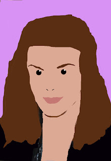
The whole idea of this task was to create a portrait of ourselves in the style of the british artist Julian Opie .
Firstly a used an original image of myself and opened it up into photoshop, I then selected the main part of the image I wanted to focus on by using the marquee selection tool, then I opened a new layer and pasted my selected photo into it which has been resized by using the selection tool.
The first element i worked with was my hair so I had to make another layer to produce it in and I used the lasso tool to trace around my hair area, I used the colour palette to select the correct colour before using the paint bucket to fill it in.
Next I created a new layer which i named face and again used the lasso tool which was a tricky part because it had to be perfectly shaped, Again I chose the correct colour before filling my face, the neck was created in the same way and by using the same colour.
Layer four consisted of eyes, I used the pencil tool to create a small diameter width which will go well with the overall effect, it was another tricky part because I needed to make sure it was the right size to cover my full eye but also have the correct effect I was looking for. I then selected a smaller brush to create a white dot inside my eye to have the character effect.
The eyebrows were layer five and I had to select the lasso tool once again to trace one eyebrow but the shift key was used to trace the other so it had more of a perfect shape. I filled the colour in again with the paint bucket tool.
Lips were the next feature I worked on and it was the same technique as the rest of the process I just used the lasso tool to trace my mouth then selected the correct colour before filling it with the paint tool.
I made another layer to fill in my clothing which give it more of a textured effect before finally adding a new layer with a background colour to take the noisy background away that was already there.

Wednesday, 15 June 2011

Chris Brown - Yeah 3X Video Analysis


Nicole Scherzinger - Wet Video Analysis


The Saturdays - Notorious Video Analysis


The sound at the beginning of this video is quite robotic and futuristic in the way that the singers voice has been manipulated to go very high pitched, this also could of been an overlay of many people's voices together but I believe the reason for this is because the band are situated in a lift but other than that I don't believe it has any relevance to the meaning of the song or video the band or director may have just decided to add a unique element to it. The rest of the beats of the song are exactly what you would normally associate with this type of band as most of there songs have an upbeat tempo which would be usually played in a club and get everyone dancing because of its catchy beat. A club is the main thing I do visualise when listening to this song and the only reason I think that is because of it's technological advancement which has been done through the editing stage makes it slightly different to what these girls normally done and means they are more up to date with the technology around today. Echoes are used a lot through the song to enhance each singers voice and make them stand out from the others in the band but also means they can expand there vocal chords in different ways rather than just singing verses, the usual echoes have been dragged out a lot longer to add again a futuristic element to the song and it works very well with the concept.

The narrative of this song is the most interesting out of every song I have analysed because its quite in depth and tells a real story that the band want to get across as the word notorious is linked to the media side of things and genuanly talked about by the general public, which is believed to be true. So each of the member of the band are trying to get the point across that they are "notorious" and go along with what the media say about them. There attitude is portrayed strongly also to show the meaning that whatever they say about them they dont care about. They are first shown in an elevator with smart office clothing on which shows a different side to them compared to their other videos this tells a story of them from day to night.

The dance moves are also very futuristic like the overall sound of the music with alot of pauses throughout to make them look more 3D and "in your face" but they work very well and the dance scene in the club on the top floor of the office is the best part of the video because it shows the girls each unique dance moves along with professional dancers how flew in from America especially. The lyrics and whole meaning of the song I don't believe are shown at all in the video, which means disjuncture is used as they are ignoring the song completely when creating the video. I believe the girls in the band has that star image in their fans eyes so they need to keep themselves popular by creating videos that many of the fans link to them, so although the video has no relevance to the actual meaning of the song, fans will still appreciate it because it's from one of their favorite bands and doing their usual dance routines and wearing the same sort of revealing clothing means they will find it more enjoyable and the song will stick with them because of how unique there style of video is.

Rihanna - Only Girl In The World Video Analysis


The sound element of the track is consistent throughout, but it doesn't make you think immediately about a type of music or genre but it's a very catchy tune and its very loud and dramatic which instantly means its going to be memorable for the viewers compared to a slower song which could take alot longer to sense the meaning of it or enjoy it as much. At the beginning of the video a soft wind sound is played showing the artist spinning around in a surreal looking place so makes viewers feel like they are in another world but also the video gives off a very positive effect because of the use of colours (pink and red) which are very girly and also the summery surroundings make the video very fun and enjoyable to many different audiences.

The chorus is when the beats really kick in as they get alot louder and faster and they also seem to jump around and repeat alot but this works well for the type of song the artist has created.
Also at the beginning of the video there is a montage of different camera angles and different scenes that the artist is in to make it more interesting to the eye and show the diversity in the editing techniques, although its not as outstanding as the rude boy video it still has elements that are up and beyond what average music videos intake such as the beautiful locations and the range of camera angles showing the beauty of the artist herself.

I believe the narrative of this music video is the artist portraying the fact that she is in a world on her own which is not a place you would usually link to being a setting for a song with such a strong message. The artist is saying that she wants someone who she maybe in a relationship with or thinks a lot about to make her feel like she is the only person he/she would think about in the world maybe by showing their love or affection and I think this is shown well throughout the video because she is the only person included in it so means she is the main focus and the different scenes she is shown in are very adventurous one scene showing her up in the clouds on a large swing gives the idea being up there she would be away from anyone else that could get involved in the experience between her and her lover. Also at the end of the video she is shown jumping around maybe even celebrating with a firework background giving the viewers the idea that she has accomplished what she intended to do and the meaning behind the ending could be if you want something from someone so much and you show them then you could have a positive ending.

By visualising the video the viewers would link it to Amplification because although some parts of the video link back to the lyrics other parts have no relevance at all which shows the director Anthony Mandler put he's own stamp on it and he's outlook on the video suggested he wanted to make the video as simple as possible but with exaggerated scenery to make her look like she's in a surreal place almost like "something from a postcard". The main lyrics that link to the video completely are "only girl in the world" while the artist is shown alone in this unreal place suggests she is the only one there which works really well.

The technical aspect of the video doesn't look like it would of had much editing done to it meaning it would change a lot of the recording footage like some of Rihanna's previous videos including Umbrella and Whos That Chick? Only girl had actually been filmed in those unreal landscapes and the artist did actually wear those outrageous outfits so all that would of needed to be considered in the editing stage of the video would of been clipping some parts of the video and adding them to the montage at the beginning as well as repeating parts of the video to go along side the fast paced beats of the songs catchy chorus. Also the extravagant fireworks at the end may have been added by editing or maybe just copied so they lasted a lot longer throughout the final scene also brightened so it caught the viewers eyes. Finally the recording team would of filmed each scene numerous times so the most important part of the editing technique would be finding the best recording and cropping it to fit exactly with the timing of the video, its a crucial part but the end result shows how much time and effort has to go into such a huge scale of a music video from such a well known artist like Rihanna.

Calvin Harris - Bounce Video Analysis


This music video is known as a distuncture because it totally ignores the meaning and the lyrics of the song and creates a video that has no relevence to any of it, but somehow this video works well and the techno tunes determine its high quality because of the artist's success. The video mainly features a man taking to the streets and at every chorus him breaking into a dance routine which is very unexpected but keeps the audience glued to see what is going to happen next. Also because the dance routine doesnt look highly choreographed it adds more of a fun factor to the video in the way that the actor who is the "main character" throughout doesn't take himself too seriously and is another reason why viewers will want to carry on watching.

The overall sound of the song is very "game console" in the way each beat is signified in a high pitched quality but for this reason viewers could think it was quite a childish kind of tune and something that this artist has never done before so have went agaisnt it wereas others could think it was good he was trying something different and enjoy the uniqueness of the song, half way through the beats start to get louder and faster and then it indicates a dance/rave kind of tune and features crowds in the video which tells the story about the actor dancing alone to the music throughout the video but then when linked to such a big crowd they are all enjoying it together, which makes me think that its going to be a dancefloor tune that is going to be remembered because its so distinctive.

Because Calvin Harris is a techno artist not many people who like for example death metal or folk music may have heard of him so because he is slightly low key to many artists he doesnt really portray that star image potential but because he's song creations are so broad and memorable to many he wouldnt be forgotton and he's outlook on he's videos show that he doesn't want to be one of those artists who fade into the background.

Rihanna - Rude Boy Video Analysis


This video has a very technical side to it in the way the entire video has been filmed against a green screen which includes all the varied sections of the video which have been projected on in the editing stage so means while filming the video the artist would of had to compremise with the limited amount of props and shots to work with, but with a direct link to the singers culture of the african kind it would of been easier for her to adapt to the situation because she has knowledge from her home town of Barbados and she will know different types of dances aswell as body language and facial expressions which automatically put agaisnt Rihanna's voice makes the audience think its the type of music people would "grind" too.

Because the artists voice is so strong with her homegrown accent its a element which makes the song alot better to understand and along with the use of cultural instruments such as bongo and steel drums and tambourines which are indicators of the African culture so they are definately sound beats that you can hear and immediately think of somewhere like Barbados or Jamaica and the sound side of the video is backed up with the amazing and colourful background throughout the video where the colours green red and yellow are used alot because they are seen as the offical colours of the Jamaican flag and they also symbolise along with the strong vibration of the drums, reggae music which is not something Rihanna has done before in her videos but this shows as an artist she likes to take risks.

The contexual knowledge i have of the song title "Rude Boy" is that it also originates from Jamaica so although the song title held alot of bad controversy in the UK because it was seen as very sexual and explicit, the artist may have wanted to go down them lines but it also could have been used because she wanted a song to work with that showed off how much she loved her culture and how bright and colourful it is which was shown by the green screen.

The camera angles vary throughout the video from meat shots of just the artist herself long shots to show the viewers the entire length of the video, although the shots may be basic of just the artist herself infront of a blank screen when filming the more experienced and complicated elements where involved in the editing stage when many different bright coloured animations for example the lion which is a exotic animal linked to places like africa so still keeping with the idea of the cultural meaning and the song title shown in many different designs and from different angles to keep the audience entertained throughout. The artist herself is shown in various ways also, mainly by a mirrored effect to show she is the "star of the show" and the brightly coloured kaleidoscope prints just give the overall final touch to the whole Jamacain scene of the video.

The Amplified visualisation of the video will be seen from the audience which means some aspects of the video link directly to the lyrics but the director of the video adds thier own personal touch which makes it unique and in this case its the quirkyness and "pop art" styled video created by Melina Matsoukas that has made the video become such a huge hit with all the artists fans and also meant she has created new fans who have seen a different side to her, this video is one of many for Rihanna that has kept up her amazing star image over the years.

Lady Gaga - Judas Video Analysis


At the beginning of the video no music is played, this makes the person viewing the video interested and wanting to find out why there is no music playing. This also introduces us to the narrative of the video, which throughout we see follows the generic conventions of a pop video by mixing the narrative with performance from the artist. The colouring of the video is almost black and white, the colours have been dulled down and this gives a dark effect. The first thing that we see on the screen is the title 'Judas' with a crucifix over the top of a scene of a motorcycle gang. This gives the immediate impression that this song may be themed on rebellion or betrayal, as Judas betrayed Jesus , the motorcycle gang also supports this impression as they are typically seen as being bad news. There is also a required element of shared knowledge needed to get this impression, as people who are not familiar with who Judas is may not be able to make the link however this is helped out by the use of a crucifix which gives the title religious connotations, even to someone who is not familiar with the story of Judas. The red writing for the title is cleverly used as this could signify passion, rebellion or possibly even blood.
As the title fades and we are introduced to a scene of a motorcycle gang driving down a road. All of the gang are wearing stereotypical matching black leather jackets with their names on the back. The first time that we see Lady Gaga we see that she is wearing bright colours which makes her stand out against the dull setting of the video. This is because she is seen as the most important person in the video and the record company want you to focus on her. The quirky and strange costume choice also signifies her personality, something which is easily recognisable to her fans.
The song is very repetitive and uses the word ‘Judas’ a lot in the beginning of the song, this sticks in the viewer’s mind as it is catchy. We see her on the back of the motorbike wearing a crown, this could symbolise her star image as she is thought to be one of the most famous people in the world but it also supports the theme of the video as we see the male who is on the front of the motorbike wearing a crown of thorns. This once again requires shared knowledge for the viewer to make the connection to Jesus. This also helps with the narrative as it could suggest that ‘Jesus’ the man who is on the front of the motorcycle is her boyfriend and she will betray him with ‘Judas’. Throughout the video it tends to follow many of the generic conventions of pop music videos whilst also having original ideas which reflect the personality and style of Lady Gaga. The costume choices used are extremely creative which appeals to a female audience for the fashion aspect, she is also portrayed as a strong individual woman which appeals to the female side of the audience. However, some of the costume choices are quite revealing and this could be saw as her being objectified, which shows that the male gaze theory is used to appeal to the male side of the audience. There are scenes of both narrative and performance throughout which is a generic convention of videos of this genre, the narrative tends to follow a linear sequence however there are some times when the narrative is completely random and does not make sense. There are shots of dance sequences which are also a convention of this genre.

Tuesday, 14 June 2011

Jessie J - Do It Like A Dude Video Analysis


Throughout the video the sounds mainly stay the same with a sort of "drum and bass" effect to it, its also very deep which indicates more of a masculine side of the character the artist is portraying. choreography is the element that indicates a change in the sound which in this case is the louder bang of the bass drum for example the artist says "stomp, stomp" and each time its said the beat comes up.
Parts of the song also include some jumps and repetition of some lyrics "jjjj jessie j" which is to emphasize points which the audience will remember for example that is her name so whatever impact its had on them it will still be memorable.

At the beginning of the sequence a heartbeat is played which instantly makes you want to know whats going to happen in the rest of the video because its quite intense and with the dark location and the variation of shots showing a female playing cards and smoking shown in a montage which are normally elements linked to the male gender so makes the viewers suddenly realize the story behind the video which is how woman perceive the male generation. This is shown by the "punky" costume she is wearing and her manly gestures throughout the video example grabbing her "crotch" and the lyrics "pour me a beer" is showing exactly that she is trying to stereotype the male audience.

The star image of Jessie J is that she is an up and coming artist and she is a very independent and quirky character, in this video she looks rather disturbed shown mainly from the "meat"
shots her thick eye make up and her punk style of clothing suggest she's not a average looking singer and likes to be remembered for what she does.

Amplification is the way in which the video can be visualized because there is some direct links from the lyrics to the video for example when the artist says "grab my crotch" she does do that hand movement but some other parts of the video do not have any link to the actual lyrics at all so it means that the director has added their own personal touch to make it unique and make the viewers think on a more broader scale about what exactly the song is trying to get across.